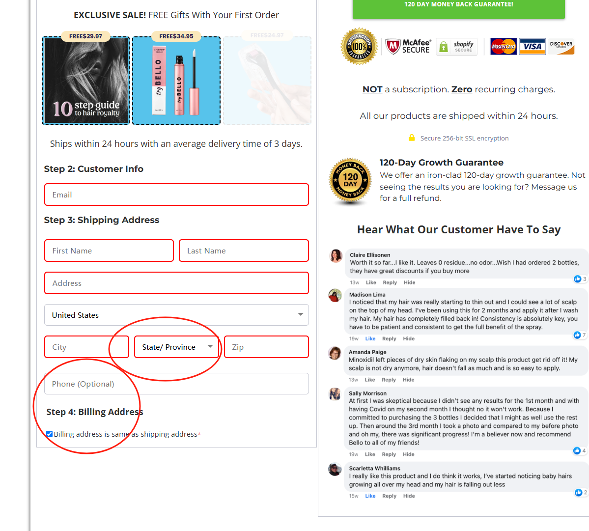
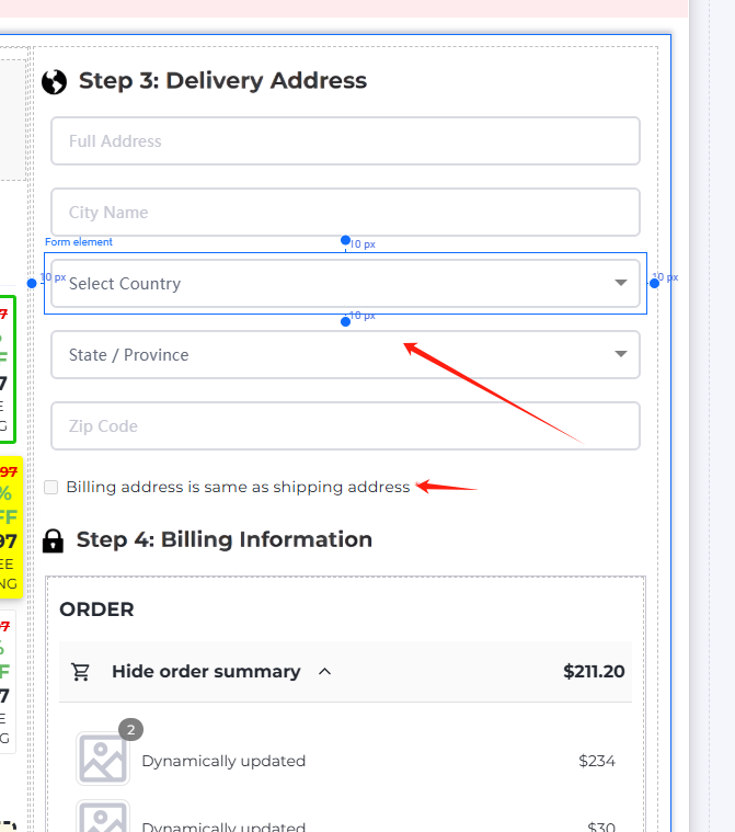
- The payment checkout page is too ugly 2. The mobile phone number selection box cannot automatically select the number input 3. The billing address country cannot be automatically selected and needs to be selected manually 3. The billing address is the same as the shipping address 4. There is no Apple quick payment function, which is not comparable to other funnels,
Just like the product of ten years ago,
Hey @US_A, thank you for taking the time to share your detailed feedback — we truly appreciate it.
We understand how critical it is for the checkout experience to feel smooth, modern, and competitive, especially in high-converting funnels. You’ve highlighted several valuable points here, and I want to address them:
- Design Improvements – We’re actively working on improving the UI/UX across the platform, including the checkout. That said, many merchants customize their pages using our advanced editor or CSS — and our team is happy to help with this if needed.
- Mobile Number & Country Fields – Your suggestions on auto-focus and pre-selection are excellent. We’ll pass this along to our product team to explore smarter defaults and improved input behavior.
- Billing = Shipping – This checkbox is available via the Compositions section, but we agree it could be more intuitive to find and use. We’re discussing ways to make this more native and visible.
- Apple Pay & Quick Payments – This is a popular request, and we’re already looking into expanding our payment integrations, including support for Apple Pay and others.
We’re committed to making Funnelish more powerful, polished, and competitive every day — and your feedback gives us the insight to do just that.
If you’re open to it, we’d love to connect 1-on-1 to better understand your use case and see how we can help you get the experience you’re looking for today — while also improving the platform for everyone.
Thanks again!