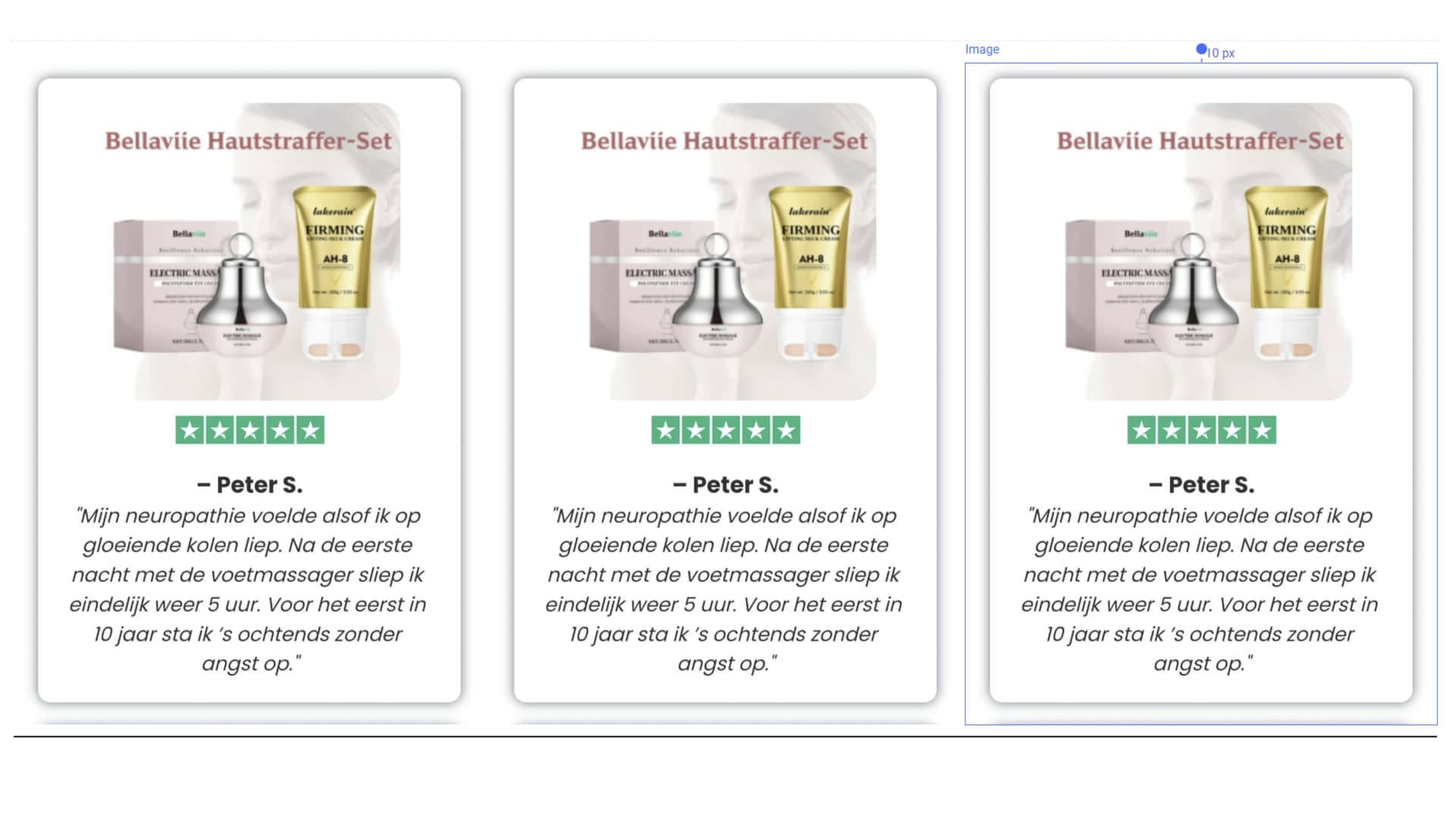
Hello, good afternoon everyone. I would like someone to help me create a testimonials carousel that slides automatically and manually, with at least 6 review containers. Below is an example that should be compatible both with PC and the mobile version.
I would like a testimonial carousel with 6 cards. The comments should rotate automatically but also allow manual navigation (arrows and indicators). The carousel should loop continuously, pause on hover, and support swipe on mobile devices.
If you didn’t get this already sorted, here is the way to do it :
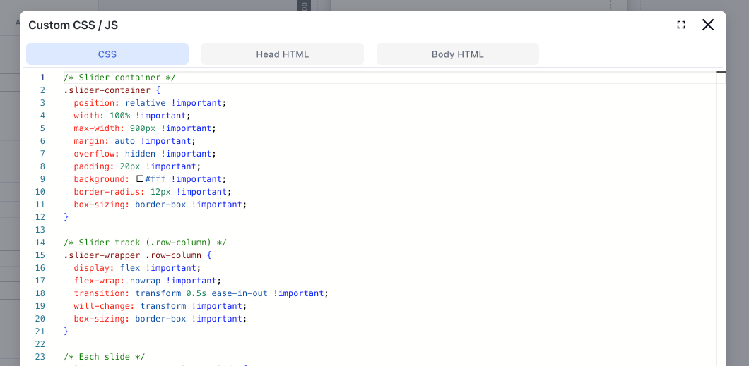
1) In Head HTML — add Slick CSS
<!-- Add the slick-theme.css if you want default styling -->
<link rel="stylesheet" type="text/css" href="//cdn.jsdelivr.net/gh/kenwheeler/[email protected]/slick/slick.css"/>
<!-- Add the slick-theme.css if you want default styling -->
<link rel="stylesheet" type="text/css" href="//cdn.jsdelivr.net/gh/kenwheeler/[email protected]/slick/slick-theme.css"/>
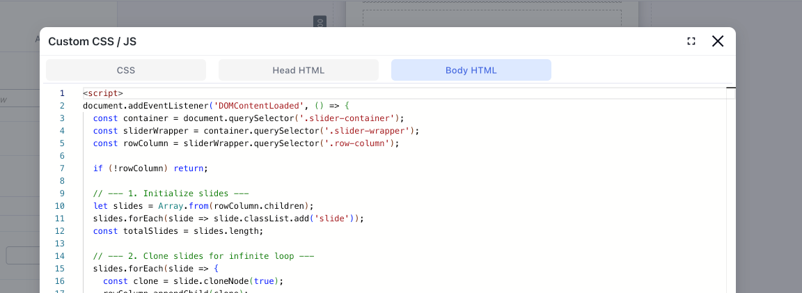
2) In Body HTML — add scripts + init
<script type="text/javascript" src="//code.jquery.com/jquery-1.11.0.min.js"></script>
<script type="text/javascript" src="//code.jquery.com/jquery-migrate-1.2.1.min.js"></script>
<script type="text/javascript" src="//cdn.jsdelivr.net/gh/kenwheeler/[email protected]/slick/slick.min.js"></script>
<script>
$(document).ready(function(){
  $('.mySlick').slick({
    infinite: true,       // Enables infinite looping
    slidesToShow: 3,      // Number of slides to show at once
    slidesToScroll: 1,    // Number of slides to scroll at a time
    arrows: false,        // Disables navigation arrows
    dots: true,          // Disables navigation dots
    autoplay: true,       // Enables autoplay
    autoplaySpeed: 3000,  // Sets autoplay speed to 3 seconds
    responsive: [
      {
        breakpoint: 768,
        settings: {
          slidesToShow: 1,
          slidesToScroll: 1,
          arrows: false,
          dots: true
        }
      }
    ]
  });
});
</script>
3) How to use it on your Funnelish page
Add the class mySlick to the wrapper that holds your testimonials.
Inside that wrapper, place your 6 testimonial cards as direct container boxes.
With this config, it shows 3 cards on desktop and 1 on mobile.
You can tweak the numbers in slidesToShow and the responsive breakpoint to fit your design.
Hope this helps! We’d be happy to implement it for you—just share the funnel share link with us through Support.