A great Call-to-Action (CTA) section can make the difference between a visitor leaving your page and becoming a customer.
In this ongoing post, I’ll share different CTA section ideas that you can recreate in Funnelish. These examples are designed to inspire your own landing pages, product pages, and sales funnels.
Each section focuses on improving conversions while staying easy to build using the Funnelish editor.
I’ll continue updating this thread with more CTA section designs over time.
CTA Collection
CTA #1 — Product Spotlight with Offer & Risk-Free Guarantee
Preview
Best For
-
Product Pages
-
Landing Pages
-
Sales Pages
-
Upsell Pages
-
Limited-Time Promotions
Why it Works
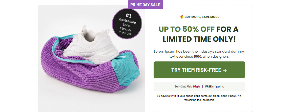
This CTA combines several conversion elements into one clean section:
-
Large product image to grab attention
-
Bestseller badge for social proof
-
Limited-time offer headline
-
Strong action button
-
Shipping and stock information
-
Risk-free guarantee to reduce buying hesitation
The layout naturally guides visitors from the product image to the offer and finally to the CTA button.
Funnelish Elements Used
-
Container
-
Image
-
Text
-
Button
-
Badge
-
Divider
-
Border & Shadow
-
Responsive Layout
Customization Ideas
You can easily adapt this section for:
-
Supplements
-
Beauty products
-
Shoes
-
Fashion
-
Electronics
-
Digital products
-
Courses
-
Services
Simply replace:
-
Product image
-
Colors
-
Offer text
-
CTA button
-
Guarantee message
CTA #2
(Coming Soon)
CTA #3
(Coming Soon)
CTA #4
(Coming Soon)
Tips
When building CTA sections, try to include at least three of these conversion boosters:
-
Strong headline
-
Clear CTA button
-
Product image
-
Discount or special offer
-
Social proof
-
Money-back guarantee
-
Limited stock or urgency
-
Free shipping
-
Trust badges
Keeping the section visually simple helps visitors focus on the action you want them to take.
I hope this CTA section gives you ideas for improving your own Funnelish pages.
I’ll continue adding more CTA layouts to this post, including different styles for product pages, landing pages, upsells, lead generation, testimonials, guarantees, pricing sections, and more.
If you recreate this section or customize it for your own funnel, feel free to share your version below. It would be great to see how others adapt these ideas for different products and industries.