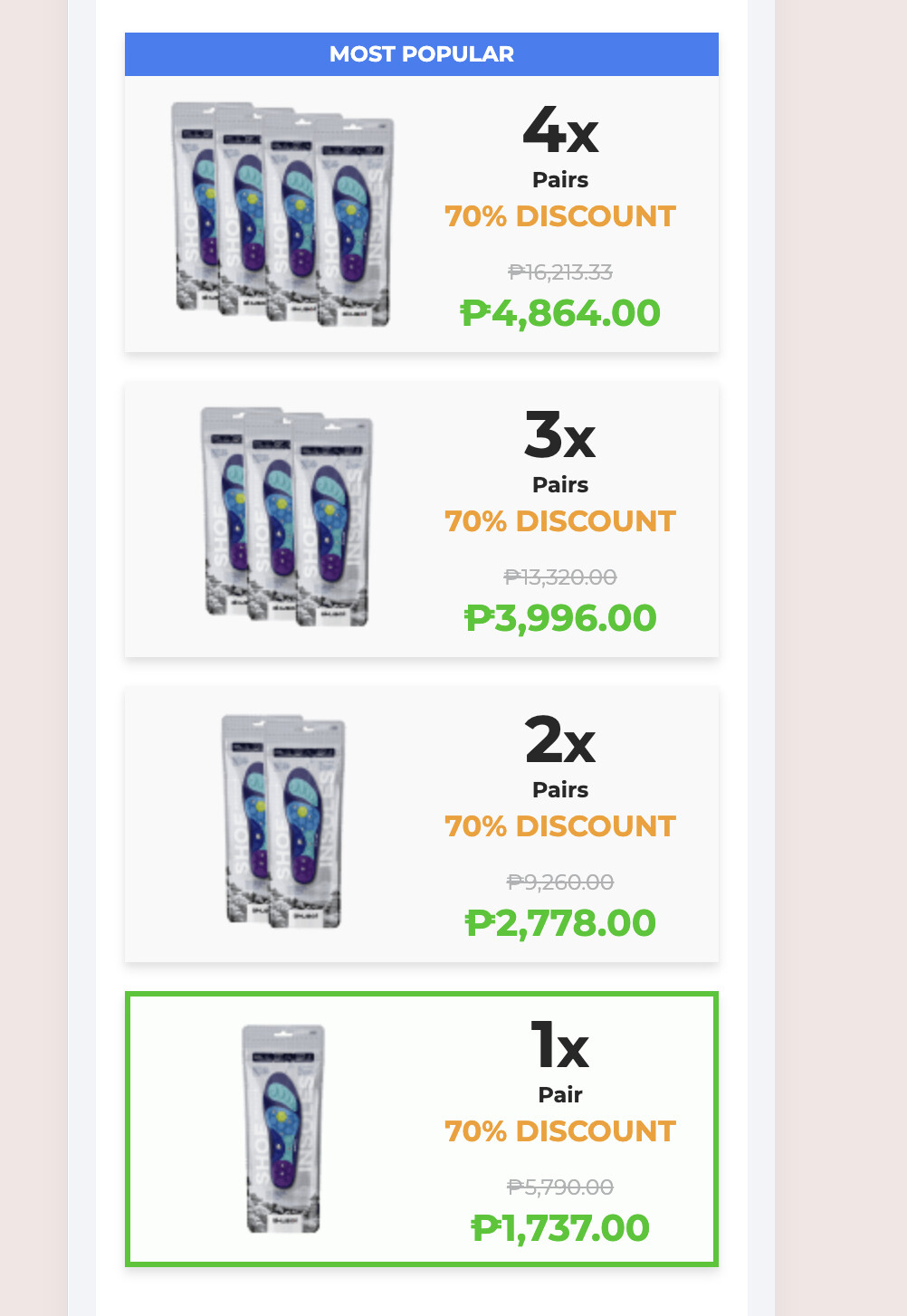
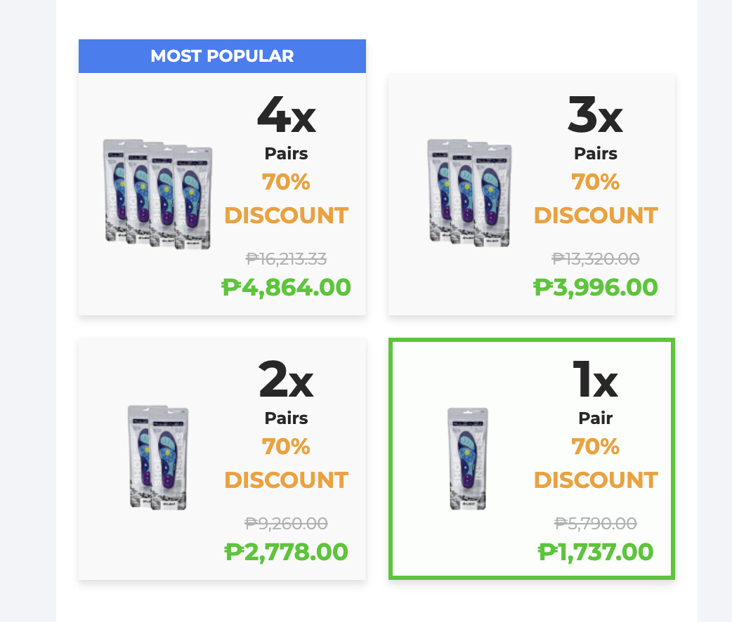
Hi, we are trying to achieve the same product list layout and text for mobile and desktop view. I know it needs css code. Anyone who can help please. Please see attached screenshots. thank you
Welcome to the Funnelish community! 
To ensure your product list looks the same on both desktop and mobile, you can use the following CSS. This will organize the product list into a neat grid layout, highlight selected products, and adjust text sizes accordingly.
.product-list .pl-items {
    display: grid;
    gap: 1rem;
    grid-template-columns: repeat(2, minmax(0, 1fr)); /* Two columns on desktop */
    position: relative;
}
.product-list .pl-item.selected {
    border: 3px solid rgb(26 199 14); /* Green border for selected items */
}
.product-list .pl-item {
    box-shadow: 0 0 8px rgba(0, 0, 0, 0.25);
    background: #f9f9f9;
    position: relative;
    overflow: visible;
}
.product-list .pl-item .pl-name .pl-nvalue .name {
    display: none; /* Hides product name */
}
.product-list .pl-item input.pl-radio {
    display: none; /* Hides radio input */
}
.product-list .pl-item .pl-name .pl-nvalue span.top-tag {
    margin-top: -86px;
    display: block;
    font-size: 0.75rem;
    line-height: 1rem;
    padding: 0.3rem;
    text-align: center;
    left: -7.75rem;
    width: 250px;
    border-radius: 3px;
}
.product-list .pl-item .pl-price .pl-pvalue p:first-child strong {
    font-size: 40px !important; /* Large font for main price */
}
.product-list .pl-item .pl-price .pl-pvalue p:nth-child(2) span {
    font-size: 12px !important;
    font-weight: bold;
}
.product-list .pl-item .pl-price .pl-pvalue p:nth-child(3) s {
    font-size: 14px;
    color: rgb(144 144 144); /* Grey color for strikethrough text */
}
.product-list .pl-item .pl-price .pl-pvalue p:nth-child(4) strong {
    font-size: 23px !important;
    color: rgb(26 199 14); /* Green discounted price */
}
.product-list .pl-item .pl-price {
    min-width: 115px;
}
.product-list .pl-item .pl-image {
    width: 100px;
    height: 100px;
}

/* Responsive design for mobile */
@media screen and (max-width: 768px) {
    .product-list .pl-items {
        grid-template-columns: repeat(1, minmax(0, 1fr)); /* Single column on mobile */
    }
}
What this CSS does:
 Uses a grid layout to align products properly.
Highlights the selected product with a green border.
Hides unnecessary text to keep the layout clean.
Adjusts font sizes for better readability.
Ensures responsiveness, showing products in one column on mobile.
Try adding this to your site and let me know if you need any adjustments! 
2 Likes