If you’re building funnels in Funnelish and trying to match a Figma or brand design, you’ve probably noticed one issue:
 The default radio buttons and checkboxes look very “browser-default” and often don’t match modern UI designs.
From a CRO perspective, this matters more than it seems:
- Inconsistent UI can reduce trust
- Unclear selection states can confuse users
- Small friction points can hurt conversion rates
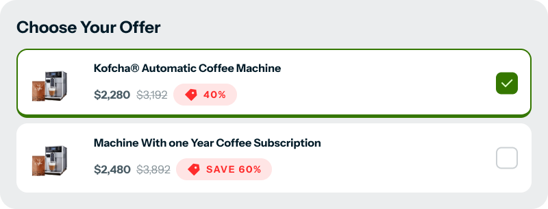
The good news? You can fully customize them using CSS only — no JavaScript needed.
 What This Solution Does
- Replaces the default browser radio & checkbox styles
- Matches clean, modern Figma designs
- Improves visual clarity for product selection
- Keeps everything lightweight and safe (CSS-only)
- Scoped to specific Funnelish elements (no global conflicts)
 How It Works (Beginner Explanation)
-
We hide the default input style using
appearance: none -
Then we rebuild the design using:
- Borders and background colors
- Rounded shapes for radios
- A clear checkmark for checkboxes
-
When the input is checked, the style updates visually so users instantly know what they selected
This makes selections feel more intentional and trustworthy, which is great for conversions.
 CSS Code (Copy & Paste)
/* Hide default radio */
.el-817885 input[type="radio"] {
  appearance: none;
  width: 16px;
  height: 16px;
  border: 1px solid #E3E8EF;
  border-radius: 50%;
  display: inline-block;
  position: relative;
  cursor: pointer;
  margin: 0;
}

/* Checked state */
.el-817885 input[type="radio"]:checked {
  border: 4px solid #3B82F6;
}

.el-817885 input[type="radio"]:checked::before {
  content: "";
  width: 10px;
  height: 10px;
  background: #fff;
  border-radius: 50%;
  position: absolute;
  top: 50%;
  left: 50%;
  transform: translate(-50%, -50%);
}

/* Custom checkbox */
.el-31642 input[type="checkbox"] {
  appearance: none;
  -webkit-appearance: none;
  width: 20px;
  height: 20px;
  border: 1px solid #E3E8EF;
  border-radius: 4px;
  cursor: pointer;
  position: relative;
  margin: 0;
}

.el-31642 input[type="checkbox"]:checked {
  background: #3B82F6;
  border-color: #3B82F6;
}

.el-31642 input[type="checkbox"]:checked::after {
  content: "";
  position: absolute;
  top: 2px;
  left: 6px;
  width: 4px;
  height: 9px;
  border: solid #ffffff;
  border-width: 0 2px 2px 0;
  transform: rotate(45deg);
}

/* Hide default radio (style like checkbox) */
div#render-table input[type="radio"] {
    appearance: none;
    width: 20px;
    height: 20px;
    border: 1px solid #CCD5E0;
    border-radius: 4px;
    /* square instead of circle */
    display: inline-block;
    position: relative;
    cursor: pointer;
    margin: 0;
    background: #fff;
}
/* Checked state */
div#render-table input[type="radio"]:checked {
    background: #3B82F6;
    border-color: #3B82F6;
}
/* Checkmark */
div#render-table input[type="radio"]:checked::before {
    content: "";
    position: absolute;
    top: 50%;
    left: 50%;
    width: 4px;
    height: 8px;
    border: solid #fff;
    border-width: 0 2px 2px 0;
    transform: translate(-50%, -60%) rotate(45deg);
}
 Important Notes
.el-817885and.el-31642are element-specific class names- These IDs can change per funnel or page
- Always inspect your element and replace them with your own class selectors
 CRO Tip
Clear, well-designed selection inputs:
- Reduce hesitation
- Increase confidence
- Make product choices feel easier
These small UI improvements can have a real impact on checkout conversions.
If you have:
- A different design style
- Hover/active state ideas
- CRO test results using custom inputs
Feel free to share or ask questions below 