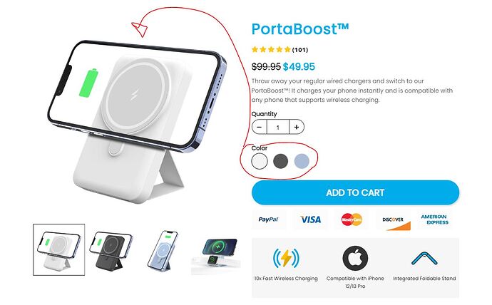
I need to create the same as hero section in shopify where everytime a color variation of the product is selected, the picture in the slider follows. like this page. can you help with this? This is a great feature of products for greater conversion of the page.
Funnelish avoids having variants and products in landing pages all together! There is no benefit to replicating Shopify on that. Instead Funnelish has variants and products at checkout/upsell stages, that way you can upsell your customers during checkout, which normally will lead to higher AOV.
Avoid replicating it that exact way and you’ll notice better AOV and better Conversion Rate as well.
As to what route we shall take?
Route A: 1 Variant W/ Checkout Soley Focused On Converting Customers
Route B: Checkout Used For Both Giving Customers Ability to Select Bundle, and Color, as well as also converting customers.
which is best option and if for Route A.) can it be achieved for other e-commerce products?
Ideally should go Route B,
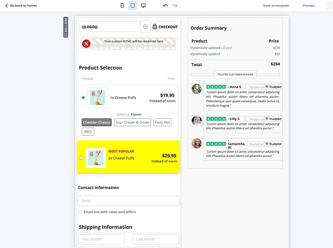
- Offer the bundles, with variants at checkout level.
- Customers are more welling to buy more once they see they can select different variants/offers…
- eg. If the customer sees they can take a bundle of 4 (two reds two blues) they are more inclined to buy more if the discount makes sense.
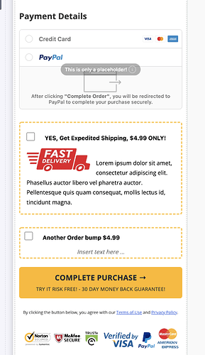
- Also, makes sense to have order bumps (multiple of them): Expedited Shipping, Insurance (if it’s an electrical gadget), Something extra…etc
- Having the selection (variant, product or bundle) being made in the landing page, is really counter intuitive and would lead to lower conversions at the landing page stage (thus less retargeting data), and would also lead to lower AOV at checkout, since the customer has made their choice already at the landing page.
Something like this below works best at checkout:
Reach out to chat support if you need hands on assistance to build something similar ![]()


