Customize Checkout Page Product List

Hi Funnelish Support Team!

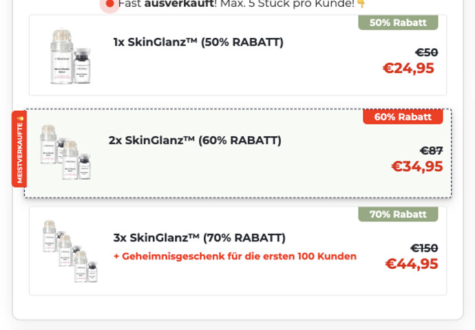
I came across a unique checkout page from another store that I’d love to replicate for my store’s checkout. It has a layout that I really like, and I know it requires some CSS code to achieve the same design. Could you guide me through the exact steps to implement it on my page? Thanks!
Hi @intelgigachad,

Welcome to the Funnelish community! :tada:

You can achieve the checkout page layout you like by adding the following CSS to your store’s checkout page. This will modify the product list design, including a bestseller tag, adjusted product image placement, and a cleaner layout.

Add this CSS:

.product-list .pl-header {
    margin-bottom: 5px !important;
    border-bottom: none !important;
    padding: 0 !important;
}
.product-list .pl-item.selected {
    border: 1px dashed #272549; /* Dashed border for selected items */
    background: #fff9ed; /* Light background for selection */
}
.product-list .pl-item {
    margin-bottom: 10px !important;
    overflow: visible;
}
/* Bestseller Tag */
.product-list .pl-item:nth-child(2)::before {
  content: "BESTSELLER";
  display: inline-block;
  position: absolute;
  left: -37px;
  top: 30px;
  font-size: 8px;
  font-weight: bold;
  color: white;
  background: #29254F;
  padding: 3px 5px;
  border-radius: 5px 5px 0 0;
  transform: rotate(270deg);
}
.product-list .pl-item .pl-inner:hover {
    background: transparent !important;
}
.product-list .pl-item.top_tag .pl-inner {
    padding: 0px 10px 0px 0px !important;
}
input.pl-radio {
    visibility: hidden; /* Hide radio button */
}
.product-list .pl-item .pl-image {
    margin: 0px 10px 0 -25px;
    width: 80px !important;
    height: 80px !important;
    border: none !important;
}
/* Side Tag */
.product-list .pl-item .side-tag {
    right: 10px !important;
    top: 0px !important;
    color: #FEF8FA !important;
    transform: unset !important;
    border-radius: 0 0 5px 5px !important;
}
/* Product Name Styling */
.pl-nvalue .name {
    position: absolute;
    top: -25px;
    font-size: 14px;
    font-weight: 600;
    width: 250px;
}
.product-list .pl-item .pl-price .pl-pvalue {
    margin-top: 15px !important;
}
.product-list .pl-item .top-tag {
    font-size: 12px;
    line-height: 1.2 !important;
    padding: 0 !important;
    color: black !important;
    background: transparent !important;
    font-weight: normal !important;
    left: 0 !important;
    top: 0 !important;
}
.tag {
    z-index: 1;
    max-width: 80px;
    margin: 0 auto -20px !important;
}
/* Mobile Adjustments */
@media only screen and (max-width: 768px) {
    .pl-nvalue .name {
        width: 200px;
    }
    .product-list .pl-item .top-tag {
        width: 150px !important;
        white-space: normal !important;
    }
}

What this CSS does:

:white_check_mark: Creates a clean layout by removing unnecessary borders and paddings.
:white_check_mark: Adds a ‘Bestseller’ tag to the second product in the list.
:white_check_mark: Hides the radio button while keeping the product clickable.
:white_check_mark: Adjusts product image size and position for a better look.
:white_check_mark: Makes text responsive for both desktop and mobile views.

How to Apply It:

:one: Copy the CSS above.
:two: Add it to your Funnelish Custom CSS settings under the checkout page.
:three: Save and refresh your checkout page to see the changes.

Let me know if you need any adjustments! :rocket:

@anwerashif will this work on upsell page checkouts as well please?

@bryan it will work only on Checkout page.

ok. thanks for coming back