The “Us vs. Them” comparison table is one of the most powerful conversion elements you can put on a landing page. When a customer is on the fence, this table serves as the final logical push, proving exactly why your product is the superior choice.
But there’s a problem: most dropshippers and D2C brands build lazy comparison tables. They rely on vague claims, generic features, and weak headlines.
Let’s look at the difference between a basic comparison table and a highly optimized, conversion-focused one, and how to easily build the winning version using Funnelish.
 The “Basic” Way
Take a look at this standard comparison table:
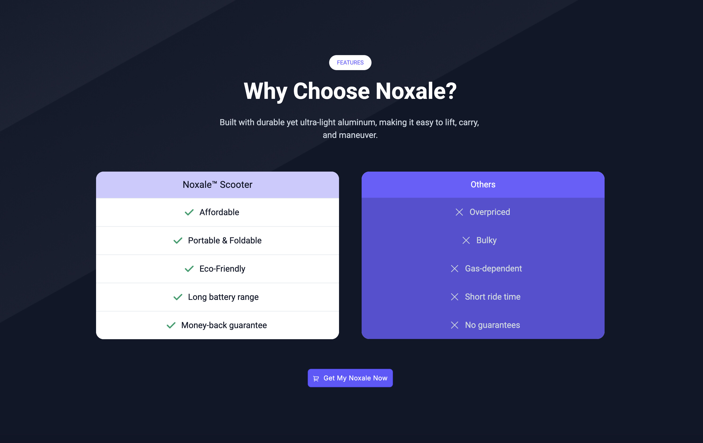
At first glance, it looks clean. But if we dig into the copy, it’s full of friction and missed opportunities:
-
Weak Headline: “Why Choose Noxale?” is generic and adds zero urgency or social proof.
-
Vague Features (Not Benefits): Words like “Affordable,” “Eco-Friendly,” and “Long battery range” are completely subjective. What does “long” mean to a commuter?
-
Weak Competitor Positioning: Saying the competition is “Overpriced” or “Bulky” is okay, but it doesn’t twist the knife into the customer’s actual pain points.
 The “High-Converting” Way (What to Do Instead)
Now, look at the optimized version:
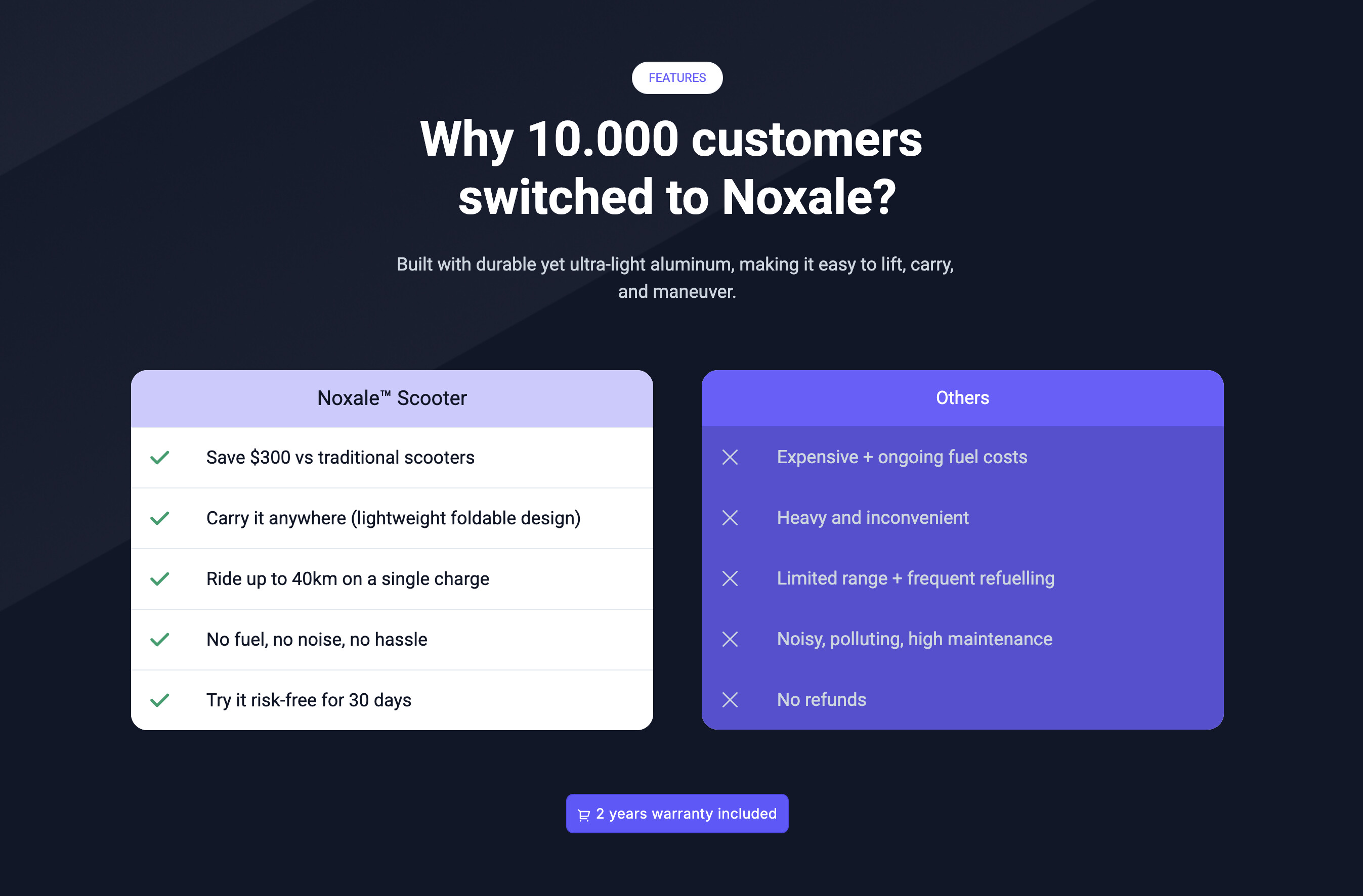
This table does exactly what direct-response copy is supposed to do: it proves value with hard facts and leverages social proof.
-
Social Proof Headline: “Why 10,000 customers switched to Noxale?” immediately builds immense trust. If 10,000 people jumped ship, this product must be better.
-
Quantifiable Benefits: Instead of “Affordable,” it says “Save $300 vs traditional scooters.”
-
Instead of “Long battery range,” it says “Ride up to 40km on a single charge.” This gives the customer exact numbers to visualize.
-
Pain-Point Targeting: The “Others” column specifically calls out the hidden headaches of the alternatives: “Expensive + ongoing fuel costs” and “Noisy, polluting, high maintenance.”
How to Build This in Funnelish (The Practical Setup)
You don’t need custom code or complex CSS to build a side-by-side comparison table like the one above. In the Funnelish page builder, you can map this out in under 5 minutes using the core layout elements: Containers and Boxes.
Here is the exact framework:
1. Structure the Layout
-
Add a new Section > Row to your page.
-
You can add a headline element for your title.
-
Then add a Container and set it to a 2-boxes layout. This will hold your “Us” and “Them” blocks.
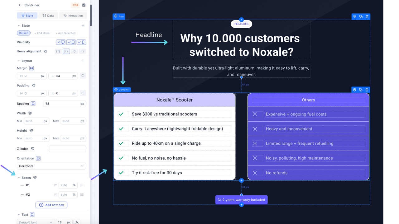
2. Customize the “Us” and “Them” Blocks
-
Drag a Container element into the left column (for your brand) and another one into the right column (for the competitor).
-
Then, to each container, add its associate boxes, which will hold: your column title, tick image, and text).
Pro UI Tip: Use color psychology. Give your Box (the left side) a bright, clean background (like white) with a subtle drop shadow so it visually “pops” forward. Give the competitor’s Box (the right side) a darker, muted background so it recedes into the background.
3. Add the Checkmarks & Copy
-
Inside your Boxes, simply use Image & Text elements.
-
Add the checkmark (
) or cross () emojis directly into the text field, or use the built-in icon elements aligned to the left of your text. -
Make sure your text formatting is identical on both sides to keep the layout perfectly symmetrical.
A high-converting comparison table isn’t just about having a pretty design; it’s about making your offer look like a no-brainer compared to the frustrating alternatives.