Hi Funnelishers,
I hope you guys are doing well. Today we are going to learn something about the Container element.
The Container is a display flex element. When we add two or more boxes to the Container element, they will be placed side by side.
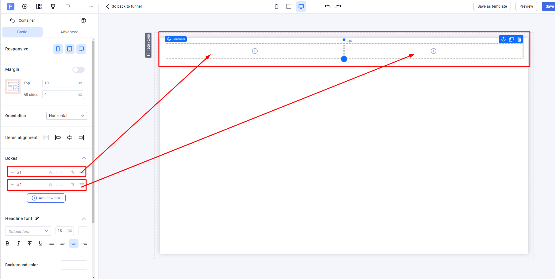
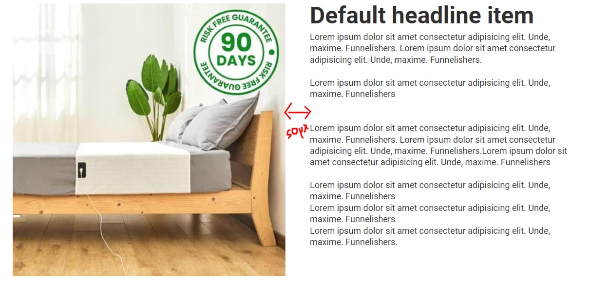
If an image is added to the first box and some text to the second box, they will look like the following screenshot if no margin or padding is used.
In the screenshot, we notice there is no gap between the image in the first box and the text in the second box. However, we can create space using the CSS gap property . To do this, we define a class called flex_gap_50 and add it to the container.

Next, we add the following CSS in More Actions > Custom Codes > CSS :
.flex_gap_50 {
  gap: 50px;
}
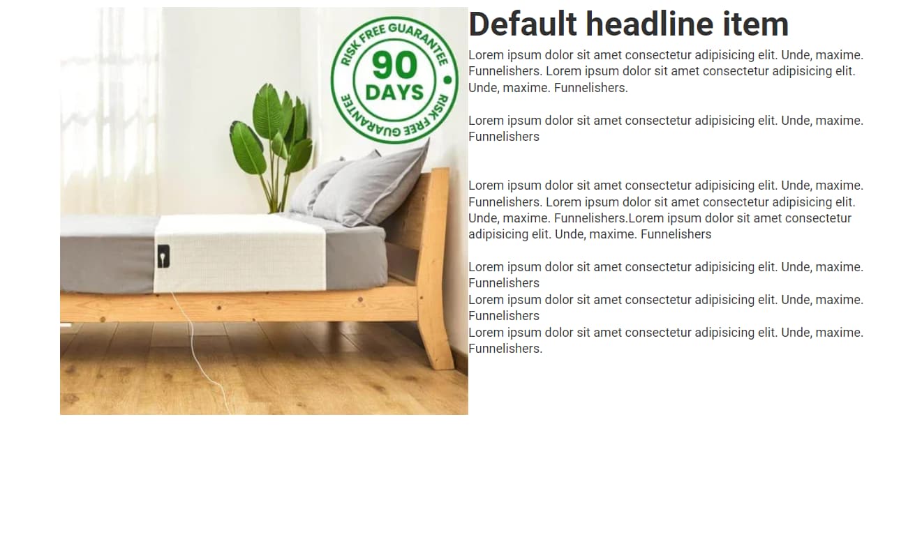
Now, we will see a 50px space between the image and the text.
But we might need different spaces for different situations, which is why we developed a JavaScript code that dynamically generates the gap for Container boxes.
Here is the code:
<script>
// ----- Dynamic Gap Styles Generation -----
document.addEventListener('DOMContentLoaded', function () {
  // Create a style element and append it to the document head for dynamic gap styles
  var styleElement = document.createElement('style');
  document.head.appendChild(styleElement);

  // Function to generate dynamic CSS rules for flex gap
  function generateGapStyles() {
    var styleRules = '';
    var processedGaps = {};
    var gapElements = document.querySelectorAll('[class*="flex_gap_"]');

    gapElements.forEach(function (el) {
      var classes = el.className.split(' ');
      classes.forEach(function (className) {
        if (className.startsWith('flex_gap_') && !processedGaps[className]) {
          var gapValue = className.split('_').pop();
          if (!isNaN(gapValue)) {
            processedGaps[className] = true;
            styleRules += `.${className} { gap: ${gapValue}px; }\n`;

            // Add the mobile-specific gap style
            styleRules += `@media (max-width: 768px) { .${className} { gap: 10px; } }\n`;
          }
        }
      });
    });

    styleElement.innerHTML = styleRules;
  }

  // Call the function once to apply initial gap styles
  generateGapStyles();

  // Start observing the document for changes in the DOM
  var observer = new MutationObserver(function (mutationsList) {
    for (var mutation of mutationsList) {
      if (mutation.type === 'childList' && mutation.addedNodes.length > 0) {
        generateGapStyles();
      }
    }
  });

  // Start observing the document for changes in the DOM
  observer.observe(document.body, {
    childList: true,
    subtree: true
  });
});
</script>
Copy the code and go to More Actions > Custom Codes > Body HTML and paste it.
Now, you do not need to write different gaps for different Containers. Just add the appropriate class. For example, if you have 3 containers and need different spaces: 25px gap for the first container, 50px gap for the second, and 70px gap for the third, just add the classes flex_gap_25, flex_gap_50, and flex_gap_70 respectively to the CSS classes field.
If you do not understand the topic or have any difficulties implementing this, feel free to comment below.