One of the biggest advantages of the Funnelish editor is that it’s designed to let you build your pages once and have them automatically across all devices (desktop, tablet, and mobile).
When sections, rows, containers, and elements have all responsive properties enabled, any design changes you make are automatically reflected across all device views. This means you don’t need to build separate versions of your page for desktop and mobile.
How Funnelish Is Intended to Work
When adding new sections, rows, containers, or elements, by default all device visibility options are enabled:
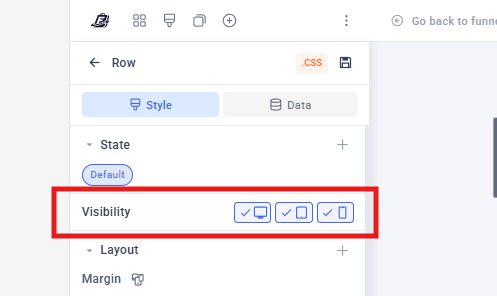
This allows a single element to be shared across all device views, making your pages easier to manage and update.
A Common Mistake We See
Some shared templates and imported pages are built using duplicated elements for different devices.
For example:
- The reviews section is created specifically for Desktop and hidden on Mobile.
- Another identical reviews section is created for Mobile and hidden on Desktop.
While this approach works, it does create additional work, as any future changes will need to be made separately on each version.
This isn’t necessary and can be avoided by using the built-in responsive settings instead.
That said, creating separate desktop and mobile versions is completely fine when required for design purposes.
The only exception is when working with checkout/upsell/downsell pages that contain:
- Product List
- Payment Form elements.
These elements should never be duplicated, as doing so can lead to issues such as broken product selection and breaking the payment form.
How to Edit Desktop and Mobile Separately
If you need an element to look completely different on desktop and mobile, you can create separate versions intentionally.
See this post for how to do that: How to Adjust a Section Width on Desktop Only Without Affecting Mobile View? - #2 by Belen_Funnelish
 Important: This method can be used with most sections, rows, containers, and content elements. However, you should never duplicate:
- Product List Elements
- Payment Form Elements
- Sections, Rows, or Containers containing Product List or Payment Form elements
Why Checkout Elements Should Not Be Duplicated
Product Lists and Payment Forms are not simple visual elements. They are core checkout components responsible for product selection, pricing, order calculations, and payment processing.
Duplicating these elements to create separate desktop and mobile versions can lead to unexpected behavior and checkout issues.
Potential risks include:
- Incorrect product selection
- If you have 3 products and selected the product 1 as default and the customer chooses product 2, the one recorded is the product 1 that is selected as default in the other view.
- Broken product list functionality
- In one of the views the product list will show without any product selected.
- Payment form validation issues
- If using CC fields, the customer won’t be able to type the card details in one or none of the views.
- Difficulties maintaining and updating the checkout in the future
For this reason, we strongly recommend maintaining a single Product List and Payment Form that is shared across all device views.
 Tip: If you need device-specific styling, adjust the surrounding layout, spacing, rows, containers, or content elements instead of duplicating the checkout elements themselves.
Best Practice Recommendation
Before creating separate desktop and mobile versions of an element, ask yourself:
Can this be achieved using normal responsive settings instead?
In most cases, the answer is yes.
Keeping a single shared element across devices makes your funnels:
- Easier to maintain
- Faster to update
- Less prone to design inconsistencies
- More scalable as your funnel grows
Only create separate versions when there is a genuine design requirement that cannot be achieved through responsive settings alone.