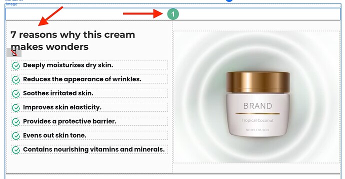
Here’s how you can achieve such layout in Funnelish, where an icon goes on top of a container border (same process can work for different elements combinations)
Elements layout
- Add your icon image on the top
- Add your other elements below (container, text any other element)
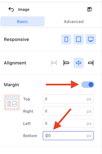
- Select the icon image and give it -20 bottom margin
-
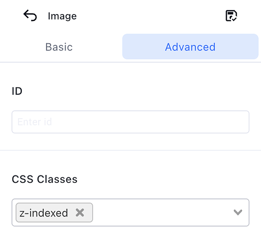
Then go to image > advanced and give it z-indexed class:
-
Ultimately, go to custom codes > css and paste this:
.z-indexed {
z-index: 3 !important;
}
Save your changes ![]()


