Sometimes we design 3 (or more) feature / pricing / selection boxes that look perfect on desktop…
But on mobile?
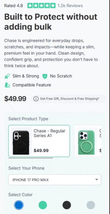
They stack vertically 
Which kills the UX — especially when you want users to compare options side-by-side.
Here’s a simple CSS-only solution to make the container horizontally scrollable on mobile 
 Use Case
Works great for:
- Product option selectors
- Pricing comparisons
- Feature boxes
- Bundle selections
- Variant-style UI
 Step 1 — Add class to MAIN container
Add this class to your container:
overflowhidden
Step 2 — Add class to INNER container
Select the container wrapper that holds your 3 boxes.
Add class:
fixedTablewidth
 Step 3 — Add this CSS
Paste inside Funnel CSS:
@media screen and (max-width: 768px) {

    .overflowhidden {
        overflow: hidden;
    }

    .container-wrapper.container_206421 {
        width: 100% !important;
        overflow-x: auto;
        -webkit-overflow-scrolling: touch;
    }

    .fixedTablewidth {
        min-width: 740px;
    }

}
 Result (On Mobile)
Boxes stay in one row
Smooth horizontal swipe
No layout breaking
No JS required
Works with interaction states
Works with variation selections
 Why This Works
Funnelish wraps elements inside container layers.
Instead of forcing flex behavior, we:
 Lock inner width
Enable scroll on wrapper
Prevent outer overflow
So layout stays stable but becomes swipeable.
 Pro Tip
Adjust this value based on number of boxes:
min-width: 740px;
Example:
| Boxes | Width Suggestion |
|---|---|
| 3 | 600–750px |
| 4 | 800–1000px |
| 5 | 1000px+ |
If anyone wants:
 Snap scroll
Partial peek effect
Auto scroll
Let me know 