Hi there!
If you’re looking to adjust the width of the text within your Funnelish order summary box (specifically, preventing the bundle name from stretching too far and bringing the pricing text closer to the left), this can easily be changed using a quick Custom CSS tweak.
As originally solved by Anwer in our community, you can use the following CSS snippet to adjust the layout perfectly.
The CSS Solution
Simply copy and paste this code into your Funnelish Custom CSS settings:
CSS
.order-summary .os-row .os-price {
    max-width: fit-content;
}
This code forces the pricing element to only take up as much horizontal space as its content requires, allowing the text on the left to balance out nicely.
If you are expanding on your checkout design, keep these modern best practices in mind:
Mobile Responsiveness First: Always test your CSS changes on mobile devices. If the text feels squished on smaller screens, consider wrapping Anwer’s code in a desktop-only media query (e.g.,
@media (min-width: 768px) { ... }) to let the mobile version stack naturally.Visual Hierarchy: Pair width adjustments with subtle tweaks to
font-weightor textcolorto ensure the final total price remains the most prominent element in the summary box.Maintain Page Speed: Funnelish prioritizes lightning-fast checkouts. Utilizing native, standard CSS classes like
.order-summaryand.os-row(as shown above) ensures your layout modifications remain lightweight and won’t negatively impact the render time or Core Web Vitals of your sales funnel.Let us know below if you need any further assistance dialing in your checkout layout!
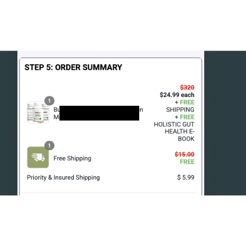
I would like to change the width of the text in the order summary box. For example, in the image attached I would like the text on the left (name of the bundle) to not go out as far, and the text on the right (pricing etc) to go out more to the left.
Was told by funnelish support that Custom CSS is required and was hoping someone would be able to help me.
Thanks