Hey everyone 
A lot of people spend hours tweaking:
-
Headlines
-
Colors
-
Fonts
-
Layouts
…but completely ignore the area around the CTA button ![]()
One small thing that consistently helps increase clicks:
 Add “Call To Action Anchors” Near Every Button
Especially on:
-
Landing pages
-
Checkout pages
-
Upsells
-
Sticky CTAs
 What Are CTA Anchors?
These are small trust-building elements placed beside or below your button.
Their job:
![]() Reduce hesitation before the click.
Reduce hesitation before the click.
 The 2 Anchors You Should ALWAYS Use
 Social Proof
Show people that others already trust you.
Examples:
-
 12,000+ Happy Customers
 -
Rated 4.8/5 by 3,200+ Buyers
-
5,000+ Verified Reviews
Even a small line helps.
 Trust Signals
Add payment / security logos near the CTA.
Examples:
-
Visa
-
Mastercard
-
PayPal
-
Apple Pay
-
Google Pay
-
SSL Secure Checkout
This instantly makes the page feel safer.
 Why This Works
When someone is about to click:
-
Their brain looks for reassurance
-
Tiny doubts kill conversions
CTA anchors remove friction.
Sometimes this tiny section improves CTR more than redesigning the whole page.
 Simple Example
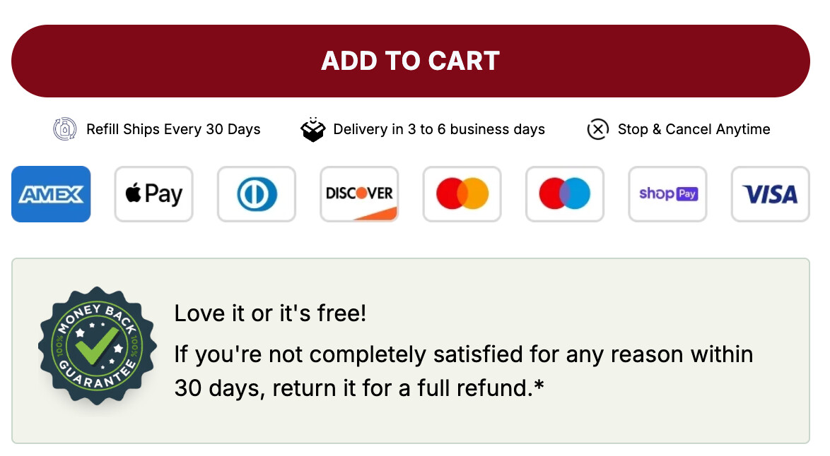
Simple.
Clean.
Effective.
 Important
Don’t overdo it.
Keep it:
-
Small
-
Clean
-
Close to the button
-
Mobile friendly
 Want to See Action Takers
Go check one of your pages right now.
Does your CTA have:
![]() Social proof
Social proof
![]() Trust logos
Trust logos
Or is the button sitting there alone? ![]()