Hey Funnelish fam ![]()
Quick CRO tip that’s taken me less than 20 minutes to implement on funnels — and it consistently moves the needle on conversions.
If you’re not placing trust elements above the fold, you are leaving money on the table.
Let me break down exactly what to do, why it works, and how to implement it inside Funnelish right now.
 Why This Matters (The 3-Second Rule)
When a cold visitor lands on your funnel — especially from a paid ad — they make a subconscious decision within 3 seconds:
“Is this a legitimate business, or am I about to get scammed?”
That judgment happens before they read your headline. Before they watch your VSL. Before they scroll anywhere.
Most store owners put trust badges in the footer. That’s the equivalent of introducing yourself after someone has already walked out the door.
The fix is simple: bring your credibility signals up where eyes land first.
 What the Data Tells Us
- Visitors who see trust signals above the fold are significantly more likely to stay on-page and engage with your offer
- Money-back guarantees reduce purchase anxiety — one of the #1 reasons cold traffic bounces
- Secure checkout badges directly address payment fears, especially on mobile
- Social proof indicators (“Trusted by 50,000+ customers”) leverage FOMO and herd behaviour
Bottom line: trust elements don’t just make your page look good — they actively remove objections before they form.
 Best Practices for Placing Trust Elements Above the Fold
Here’s what’s working across the funnels I’ve built and tested:
1. Place the badge row directly beneath your CTA button
Don’t bury them. The sweet spot is immediately below your “Add to Cart” or “Shop Now” button — right where the eye travels after reading your headline.
2. Use icons + short text (3–4 words max)
Scannable beats readable. Visitors shouldn’t need to read your trust badges — they should feel them instantly.
3. Limit to 4–6 badges
More than 6 starts to look cluttered and loses impact. Pick the badges most relevant to your specific offer and audience’s biggest objections.
4. Keep the style clean and on-brand
Grey or dark icons on a neutral background. No flashy graphics. The badge row should support your CTA — not compete with it.
5. Stack to 2 columns on mobile
Responsive layout is non-negotiable. A badge row that wraps badly on mobile destroys the credibility you’re trying to build.
 Trust Badges That Actually Convert
These are the ones I’ve seen perform consistently across niches:
| Badge | Best For |
|---|---|
| All offers — addresses payment fear | |
| Physical products, supplements, fashion | |
| Physical products — one of the top objections | |
| Fashion, footwear, home goods | |
| Higher ticket items, health & wellness | |
| Social proof play — works on all verticals |
Pro tip: Match your badges to your audience’s specific fears. Running supplement ads to cold traffic? Lead with Money Back Guarantee and Lab Tested. Selling fashion? Easy Returns and Fast Shipping will do the heavy lifting.
 How to Implement This in Funnelish (Step-by-Step)
This literally takes 15–20 minutes:
Step 1 — Open your funnel page in the Funnelish editor and navigate to your Hero section.
Step 2 — Add a new Row element directly below your CTA button. Set it to 4 or 6 columns depending on how many badges you want to show.
Step 3 — Inside each column, add an Icon element paired with a Text element. Keep the text ultra-short: “Fast Shipping”, “Secure Checkout”, “Money Back”.
Step 4 — Set the row background to transparent or a subtle light/dark strip — it should not visually compete with your main CTA button.
Step 5 — Switch to mobile view and set the badge row to wrap to 2 columns using the responsive settings. Test it. Make sure it looks clean.
Step 6 — Save, publish, and check it on a real device before sending traffic.
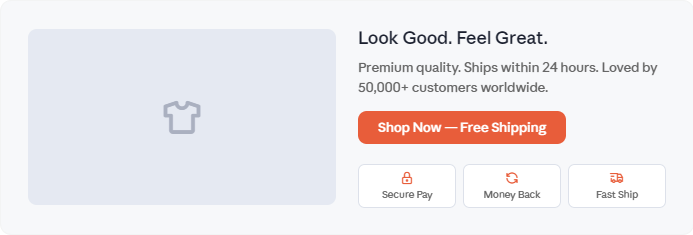
 Featured Image Suggestion
For anyone looking to use this as a template or visual reference:
Picture a clean, modern Funnelish landing page hero section:
- Left side: High-quality product image on a white or light background
- Right side: Bold headline (“Look Good. Feel Great.”), a 1-line sub-headline, and a high-contrast CTA button (“Shop Now — Free Shipping”)
- Directly beneath the CTA: A horizontal row of 3–4 small icon + text trust badges (Secure Pay · Money Back · Fast Shipping · Easy Returns)
- Overall feel: Minimal, conversion-focused, no distractions — the kind of hero section that makes a first-time visitor feel safe enough to click
This layout works especially well for fashion, health, beauty, and lifestyle products running paid traffic.
 Key Takeaway
You don’t get time to earn trust on a cold funnel — you have to display it instantly.
Trust badges above the fold are one of the highest-ROI, lowest-effort changes you can make to any funnel page. It doesn’t require a redesign. It doesn’t require a developer. It just requires putting credibility signals where visitors’ eyes land first — before they have a chance to bounce.
Test it. I guarantee you’ll see a difference.
 Let’s Talk — Drop Your Experience Below
Which trust badge has made the biggest impact on your funnel?
Are you running icons only, icons + text, or full badge graphic rows? Have you tested different badge combinations across verticals — fitness, beauty, supplements, home goods?
Drop your results or questions below ![]() — would love to see what’s working for the community and build on this together.
— would love to see what’s working for the community and build on this together.