| A plug-and-play eCommerce funnel template designed specifically for low-ticket, consumable products to help increase AOV using a problem/solution framework. | |
| Landing Page |
|
If you are selling low-ticket, consumable products like organic soap, shampoo bars, or skincare, you’ve probably noticed that sending cold traffic straight to a standard eCommerce storefront can be tough.
Traditional product pages are often built for browsing, which can lead to high ad costs, lower conversion rates, and a lot of window shoppers.
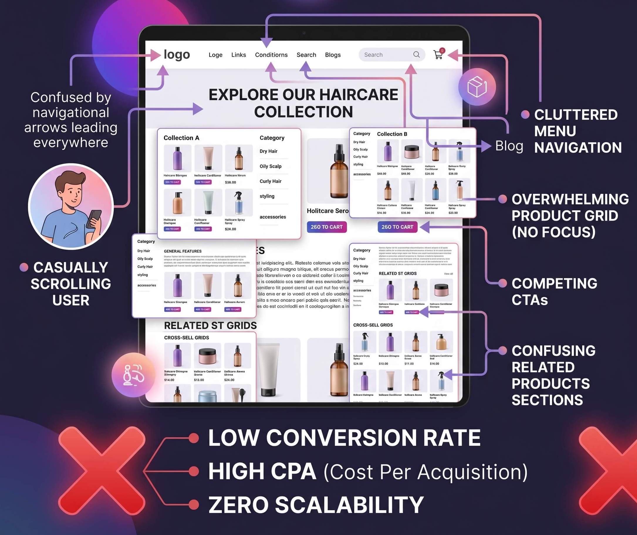
To make the economics work for repeat-purchase items, it’s usually much more effective to guide visitors through a dedicated eCommerce funnel.
We put together a complete, ready-to-use template tailored for the organic hair and body care niche to help you streamline the buying process. Here is a look at how it’s structured and why we designed it this way. ![]()
The Funnel Flow
This template is focused on keeping the user experience distraction-free while naturally encouraging a higher Average Order Value (AOV). It includes:
-
A Dedicated Landing Page: Focused heavily on product education, ingredient transparency, and core benefits.
-
A Frictionless Checkout: Clean, easy to navigate, and highly optimized for mobile users.
-
A 1-Click Upsell: A post-purchase offer designed to increase AOV without interrupting the initial checkout flow.
Step-by-Step Breakdown: Why This Structure Works
Instead of relying on walls of text, this template uses highly visual, scannable sections tailored to an audience looking for specific solutions (like fixing a dry scalp or finding chemical-free alternatives).
1. The Landing Page (Problem  Solution)
Customers in this space are usually looking to solve a specific problem. Instead of leading with generic product features, the page immediately addresses those pain points using a clear “Problem vs. Solution” visual block (e.g., Flaking/Tight vs. Balanced/Refreshed).
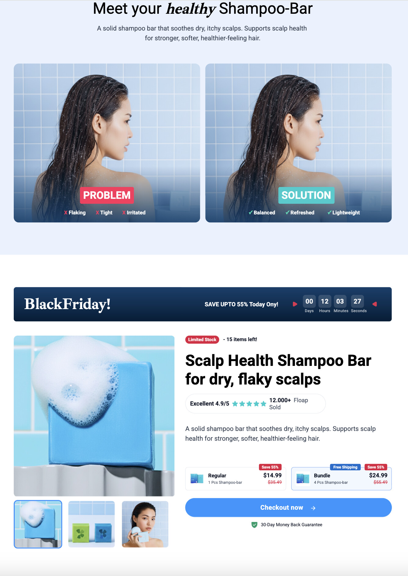
By combining ingredient storytelling with clean, easy-to-read icons, the page builds trust quickly and guides the visitor straight to your offer.
2. The Checkout Page (Trust & Clarity)
A blank or confusing checkout is one of the biggest causes of cart abandonment.
To keep friction to a minimum, we placed visual reminders of the offer—like “Free Gifts,” simple order bumps, and relatable UGC (User Generated Content) reviews—right alongside the payment section.
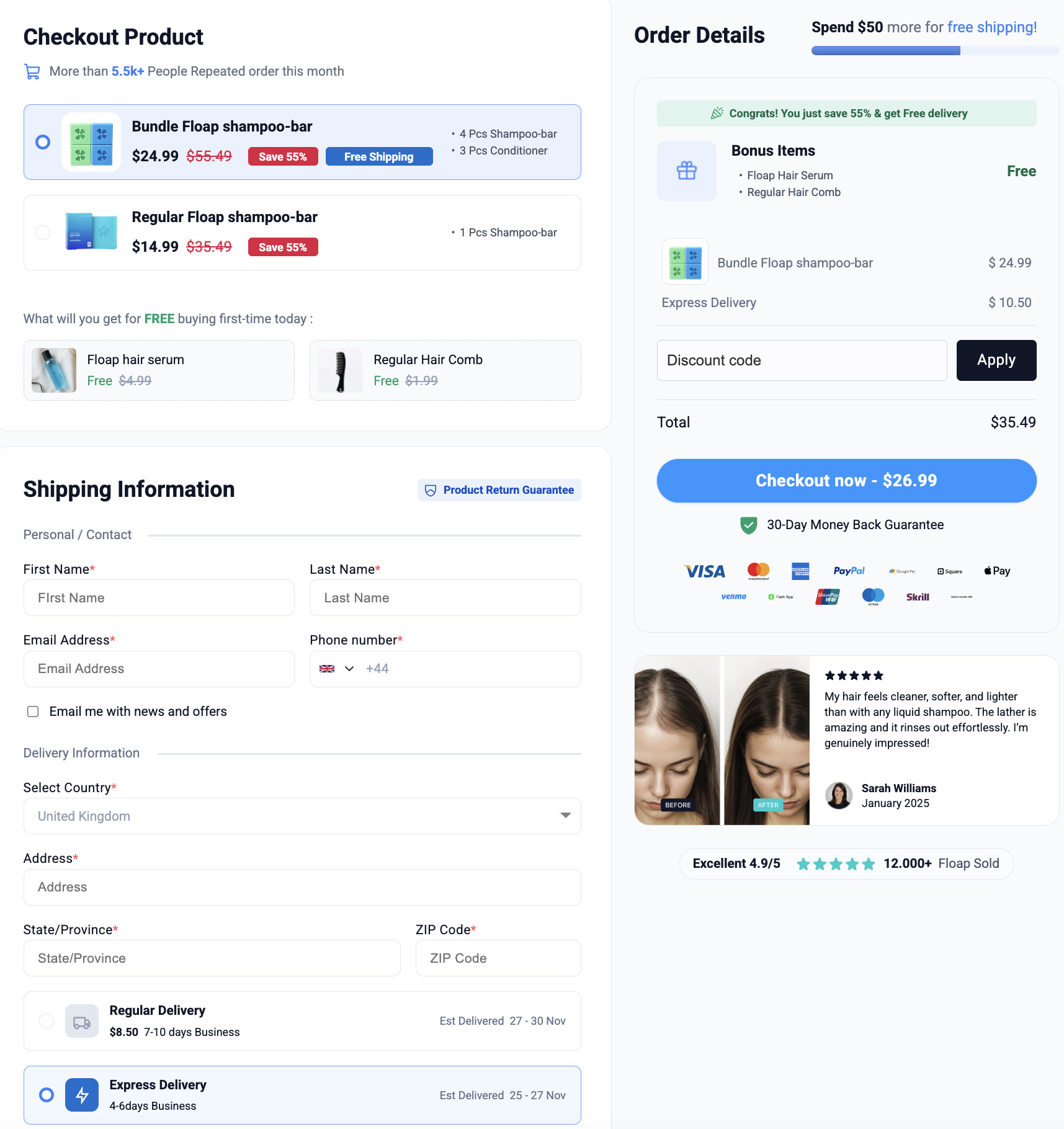
We also kept the 30-day guarantee highly visible to help reduce any last-minute buyer hesitation.
3. The Upsell Page (Building AOV)
Acquiring a customer profitably on a $15 consumable product is challenging without offering bundles.
Since shampoo bars and organic soaps are products people eventually run out of, the post-purchase upsell step offers them a chance to stock up on a 3-month supply.
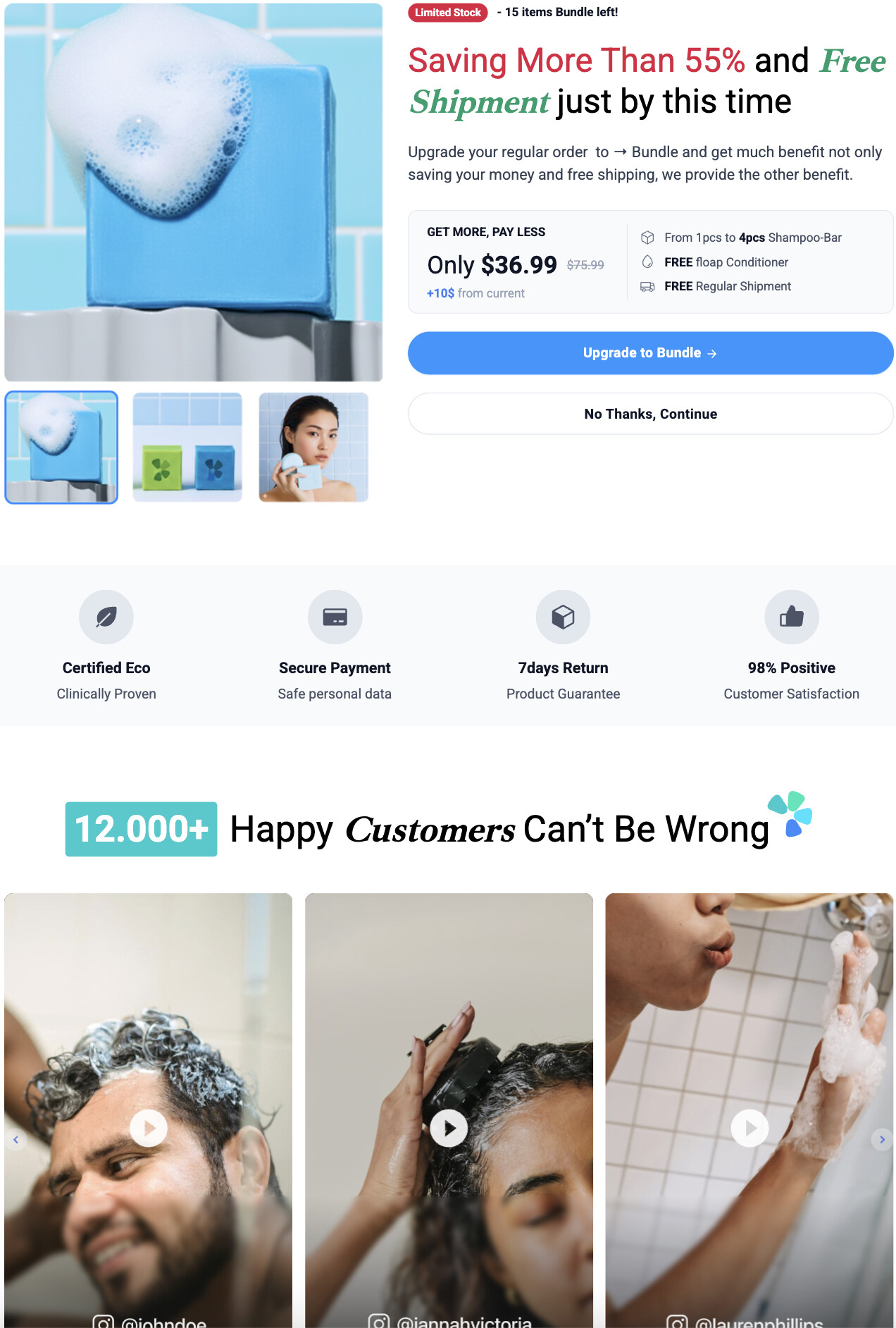
Because their payment information is already vaulted from the initial checkout, they can add this bundle to their order with a single click.
Import This Template to Your Workspace
You can import this exact 3-step funnel directly into your account and customize it for your brand. Just swap out the logos, adjust the brand colors, plug in your specific products, and you’ll be ready to test it with your own traffic.
![]() Click here to clone the complete template into your Funnelish account!
Click here to clone the complete template into your Funnelish account!
Need help or looking for a different design?
-
 Got a question? If you run into any issues setting this up, feel free to drop a reply below or start a new thread in the Ask the Community Ask the community section.
 -
 Browse more templates: If this design isn’t quite right for your product, you can find more templates, share your own creations, or request a custom layout in our Templates Templates category.