We’re looking for help with getting a code to make the imageslider images slide. Our users visiting on mobile can’t slide with their finger to see more images from our imageslider and the arrows on left and right side is not visible on the sides. We’re kindly asking for a prompt reply and help to get the imageslider images slideable and possibly some better arrows, more visible showing in a different more clear way.
Please help, support told us to ask support. We asked this before here but never got a reply either
dev team, can you please help?
Can funnelish dev team please help us with this?
Why is this not a native future in the imageslider? Can any dev send this code out to the people
Support redirects us here for the third time and we’re getting ignored. Been months waiting since first asking for this
UPDATING… We still need help.
Hi @devom, here’s a quick solution to make your images slider functional and user-friendly for both mobile and desktop. Below is a code snippet that uses a combination of HTML, CSS, and JavaScript to create a responsive, touch-enabled image slider:
Using the image slider in Funnelish involves embedding the slider code within your Funnelish page’s custom code settings. Here’s how to do it step-by-step:
Step 1: Add the Slider HTML
-
Open your Funnelish editor.
-
Go to the page where you want to add the image slider.
-
Add a Custom HTML element (or any code editor block provided by Funnelish).
-
Paste the HTML code from the slider into this block:
<div class="image-slider"> <div class="slider-container"> <div class="slider"> <img src="https://via.placeholder.com/600x300" alt="Image 1"> <img src="https://via.placeholder.com/600x300" alt="Image 2"> <img src="https://via.placeholder.com/600x300" alt="Image 3"> <!-- Add more images as needed --> </div> </div> <button class="arrow left-arrow">←</button> <button class="arrow right-arrow">→</button> </div>Replace the
srcof each<img>tag with your actual image URLs.
Step 2: Add the CSS
- Open the Custom CSS section in Funnelish:
- Go to Settings > Custom CSS (or the CSS editor for the page).
- Paste the following CSS code:
.image-slider {
  position: relative;
  overflow: hidden;
  width: 100%;
  max-width: 600px; /* Adjust width as needed */
  margin: 0 auto;
}

.slider-container {
  overflow: hidden;
  width: 100%;
}

.slider {
  display: flex;
  transition: transform 0.3s ease-in-out;
}

.slider img {
  width: 100%;
  flex-shrink: 0;
  user-select: none;
  pointer-events: none;
}

.arrow {
  position: absolute;
  top: 50%;
  transform: translateY(-50%);
  background: rgba(0, 0, 0, 0.5);
  color: white;
  border: none;
  padding: 10px;
  cursor: pointer;
  z-index: 10;
  font-size: 20px;
}

.left-arrow {
  left: 10px;
}

.right-arrow {
  right: 10px;
}

.arrow:focus {
  outline: none;
}

.arrow:hover {
  background: rgba(0, 0, 0, 0.8);
}
Step 3: Add the JavaScript
- Go to the Custom JavaScript section in Funnelish:
- Navigate to Settings > Custom JavaScript (or the page-specific JS editor).
- Paste the JavaScript code:
document.addEventListener("DOMContentLoaded", () => {
  const slider = document.querySelector(".slider");
  const leftArrow = document.querySelector(".left-arrow");
  const rightArrow = document.querySelector(".right-arrow");

  let currentIndex = 0;

  const slideImages = (direction) => {
    const images = slider.querySelectorAll("img");
    const totalImages = images.length;
    const sliderWidth = slider.parentElement.offsetWidth;

    if (direction === "next") {
      currentIndex = (currentIndex + 1) % totalImages;
    } else if (direction === "prev") {
      currentIndex = (currentIndex - 1 + totalImages) % totalImages;
    }

    slider.style.transform = `translateX(-${currentIndex * sliderWidth}px)`;
  };

  rightArrow.addEventListener("click", () => slideImages("next"));
  leftArrow.addEventListener("click", () => slideImages("prev"));

  // Enable swipe for touch devices
  let startX = 0;

  slider.addEventListener("touchstart", (e) => {
    startX = e.touches[0].clientX;
  });

  slider.addEventListener("touchmove", (e) => {
    if (!startX) return;
    const moveX = e.touches[0].clientX - startX;

    if (moveX > 50) {
      slideImages("prev");
      startX = 0; // Reset startX
    } else if (moveX < -50) {
      slideImages("next");
      startX = 0; // Reset startX
    }
  });

  slider.addEventListener("touchend", () => {
    startX = 0; // Reset startX
  });
});
Step 4: Test the Slider
- Save your changes in Funnelish.
- Open your Funnelish page in a browser and test:
- Ensure the slider works with both mouse clicks (arrows) and touch gestures.
- Adjust the width (
max-widthin CSS) if needed for better responsiveness.
Optional Improvements
- Autoplay: Add a feature to slide automatically after a few seconds.
- Indicators: Add dots or thumbnails for easier navigation.
-
Lazy Loading: Use
loading="lazy"in the<img>tags to optimize performance.
Let me know if you need further assistance or customizations for Funnelish!
Unfortunately it doesn’t work, we tried many times
Hi @devom,
Thank you for reaching out. We’d be happy to help you with making the image slider swipeable for mobile devices and enhancing the visibility of the arrows.
Could you please provide us with the following details to ensure the solution aligns with your current setup?
- Reference URL: If possible, share the live URL of the page with the image slider so we can better understand the issue.
- Code Details: Let us know whether you’re using a specific library or framework for the slider (e.g., Swiper.js, Slick Slider, etc.) or if it’s a custom implementation.
Once we have this information, we’ll quickly provide the required code or steps to resolve the issue.
Looking forward to your response!
Best regards
@anwar i use nothing, only imageslider and images. can you please create a test funnel for this and share us the sharelink? thank you
hi @devom,
this code will resolve your issue.
.is-thumbnails {
  display: flex; /* Ensure items are aligned horizontally */
  overflow-x: scroll; /* Enable horizontal scrolling */
  scroll-snap-type: x mandatory; /* Smooth scrolling for snapping effect */
  -webkit-overflow-scrolling: touch; /* Smooth scrolling for iOS */
}

.is-thumbnails::-webkit-scrollbar {
  display: none; /* Hide the scrollbar for a cleaner look */
}

a.prev, a.next {
  position: absolute;
  top: 50%;
  transform: translateY(-50%);
  z-index: 10;
  background: rgba(0, 0, 0, 0.5); /* Add a background for visibility */
  color: white;
  padding: 10px;
  border-radius: 50%;
  cursor: pointer;
  display: flex;
  align-items: center;
  justify-content: center;
}

a.prev {
  left: 10px; /* Adjust for mobile */
}

a.next {
  right: 10px; /* Adjust for mobile */
}

/* Ensure arrows are visible on smaller screens */
@media (max-width: 768px) {
  a.prev, a.next {
    font-size: 1.2rem; /* Adjust size for better visibility */
  }
}
here is the js code.
document.querySelectorAll(".image-slider").forEach(function(slider) {
    let isTouching = false; // Track whether the user is interacting
    let startX = 0; // Initial touch position
    let moveX = 0; // Current movement distance
    const thumbnails = slider.querySelectorAll(".is-thumbnail");
    const mainImage = slider.querySelector(".image-resize img");
    const totalImages = thumbnails.length;

    // Helper: Update Main Image
    function updateMainImage(index) {
        thumbnails.forEach((thumb, i) => {
            if (i === index) {
                thumb.classList.add("selected");
                mainImage.src = thumb.dataset.img;
                mainImage.srcset = thumb.dataset.img + " 1x";
            } else {
                thumb.classList.remove("selected");
            }
        });
    }

    // Detect current selected index
    function getCurrentIndex() {
        return Array.from(thumbnails).findIndex((thumb) =>
            thumb.classList.contains("selected")
        );
    }

    // Start touch
    slider.addEventListener("touchstart", function(e) {
        isTouching = true;
        startX = e.touches[0].pageX; // Capture initial touch position
        moveX = 0; // Reset movement
        slider.style.transition = "none"; // Disable transition during touch
    });

    // Move touch
    slider.addEventListener("touchmove", function(e) {
        if (!isTouching) return;
        moveX = e.touches[0].pageX - startX; // Calculate distance moved
    });

    // End touch
    slider.addEventListener("touchend", function() {
        if (!isTouching) return;
        isTouching = false;
        slider.style.transition = ""; // Enable transitions

        // Detect swipe direction
        const currentIndex = getCurrentIndex();
        if (moveX < -50) {
            // Swipe left: Go to the next image
            const nextIndex = (currentIndex + 1) % totalImages;
            updateMainImage(nextIndex);
        } else if (moveX > 50) {
            // Swipe right: Go to the previous image
            const prevIndex = (currentIndex - 1 + totalImages) % totalImages;
            updateMainImage(prevIndex);
        }
    });
});
let me know if this help, mark it as solution to solve this thread.
can you guide us where to add this code? we added the first code to CSS and the second code to HTML BODY, it didn’t work with the imageslider, it is still not sliding on mobile when you drag your finger to swipe to next image
thank you!
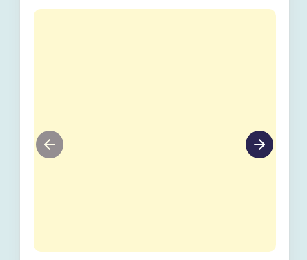
Can we have the CSS to make the buttons/arrows like this image?