Hey everyone 
One of the most common conversion mistakes I see is this:
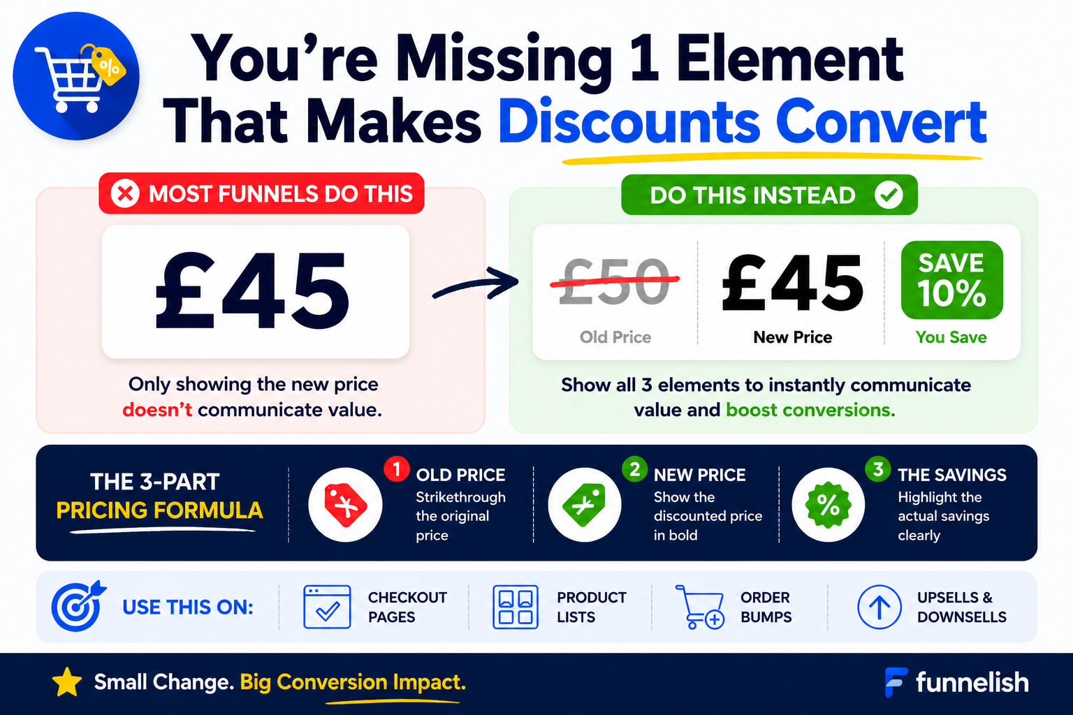
 Showing only the discounted price.
Example:
Only $45 Today
While that’s better than nothing, you’re leaving money on the table.
 How People Evaluate Deals
Customers don’t automatically know if your offer is good.
They compare:
- What it used to cost
- What it costs now
- How much they’re saving
If you only show the new price, you’re forcing them to do the math themselves.
And most people won’t.
 The 3 Elements Every Discount Should Have
 Original Price (Strikethrough)
Show what the customer would normally pay.
Example:
$50.00
This creates a reference point.
 New Price (Bold & Obvious)
Make the discounted price impossible to miss.
Example:
$45.00
This should be the visual focus.
 Actual Savings
Tell them exactly what they’re saving.
Examples:
 Save 10%
Save $5
Save $120 Today
This helps customers instantly understand the value of the offer.
 Example
Instead of:
$45.00
Show:
~~$50.00~~ $45.00 Save 10%
Simple.
Clear.
High converting.
 Why This Works
When visitors see:
- The old price
- The new price
- The saving
Their brain immediately recognizes:
“I’m getting a deal.”
That’s much more persuasive than just showing a number.
 Works Everywhere
This applies to:
- Landing pages
- Checkout pages
- Product lists
- Order bumps
- Upsells
- Sticky offers
Anywhere you display a discounted price.
 Bonus Tip
If possible, make the savings stand out visually.
Examples:
Save 10%
Save $50
Today Only
Small badges like these grab attention and help reinforce value.
 Want To See Action Takers
Go check one of your funnels right now.
Are you showing:
Old Price
New Price
Savings
Or are you only showing the new price?
Sometimes a tiny pricing tweak like this can have a bigger impact than redesigning the whole page 