This section shows you all the essential design and editing tools you need to add content, display products, and build your brand.
The Funnelish Drag-and-Drop Page Builder is a powerful, no-code design studio built specifically for e-commerce. Whether you are building a high-converting Advertorial, a seamless Checkout page, or a one-click Upsell, our builder allows you to create pixel-perfect, lightning-fast pages tailored to your offer and your audience.
Watch this video to get a comprehensive overview of our editing tools:

 Opening the Editor
Editing your funnel is a simple two-step process: open your funnel, then launch the editing dashboard.
Step 1: Open your funnel
-
Log in to your Funnelish account.
-
Click Funnels at the top navigation menu.
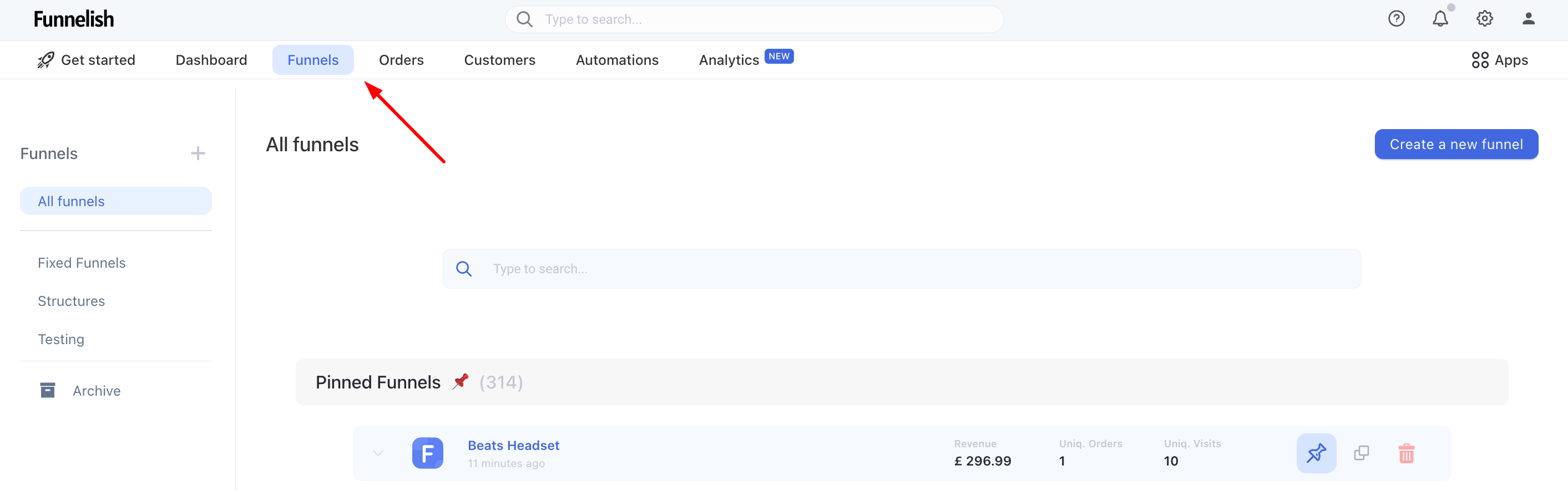
- On the Funnels page, click the specific funnel you want to edit.
Step 2: Launch the Page Builder
-
Inside your funnel dashboard, click on the Step (page) you want to design.
-
Click the blue Edit page button.
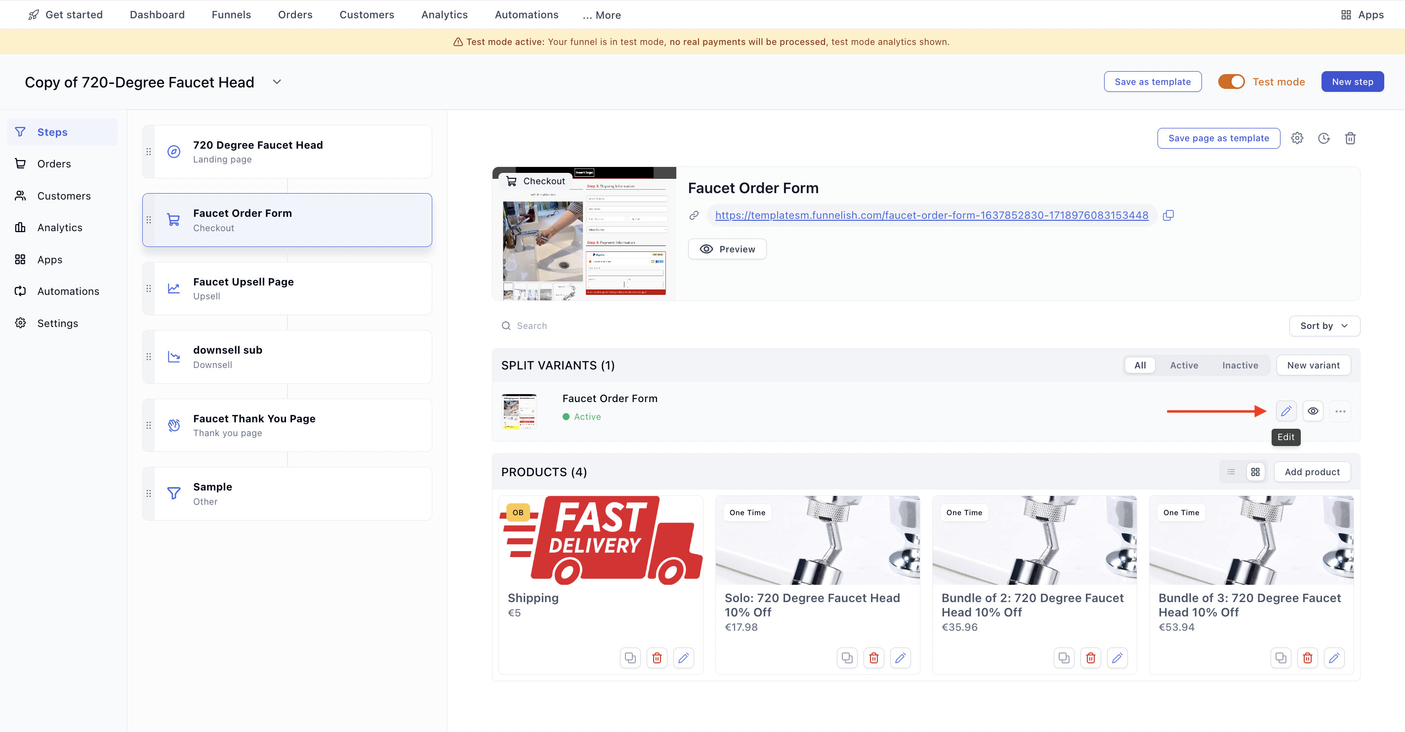
Launch the Edit page dashboard.
- The Editor dashboard will now display your page canvas.
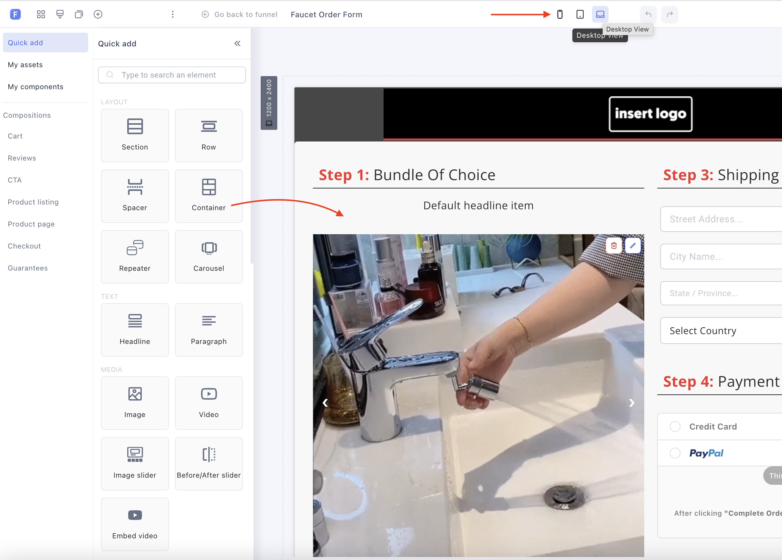
The Funnelish page editor canvas.
Note: To safely exit the editor at any time, click the Go back to funnel button in the top left corner. Just make sure you click Save changes first!
 Navigating the Editor Dashboard
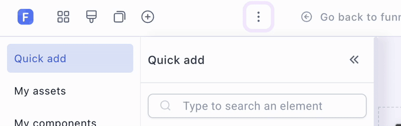
A lot of your content creation work starts in the top left corner of the editor. You will see a group of icons that change the tools displayed in the left-hand panel. This panel holds all the widgets and settings you need.
Here are the five essential icons you will use:
-
Add new element (
+): Opens the library of drag-and-drop components (text, images, checkout forms, etc.). -
Layout (Layers): Displays a structured list of all the elements currently on your page. Great for finding hidden elements!
-
Page Properties (Gear): Access basic page settings (background colors, typography) and advanced options (custom CSS IDs and classes).
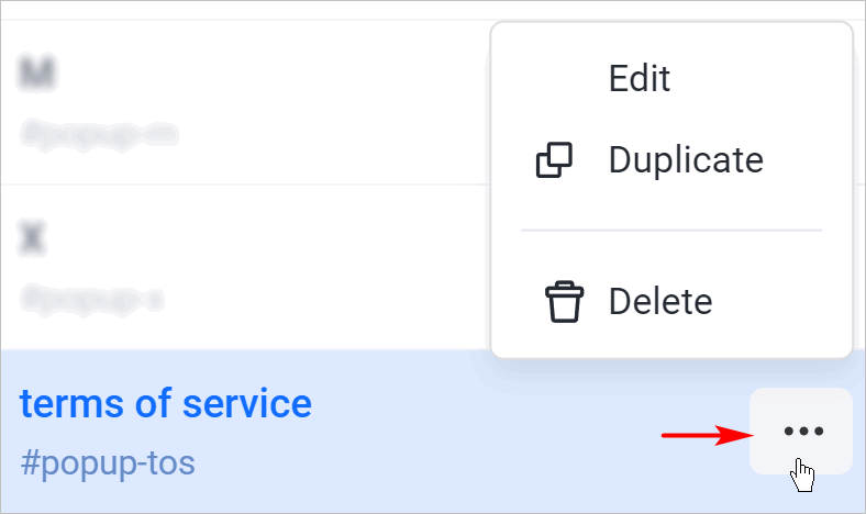
-
Popups: View and manage active popups. Click the ellipsis (
...) next to a popup to open the Quick Actions menu where you can edit, duplicate, or delete it.
-
More actions (Hamburger menu): Opens a deeper menu granting access to global Settings and Custom Codes (like adding a Facebook Pixel to this specific step).
 The Core Structure: Sections, Rows, and Elements
To keep your pages highly responsive, the Funnelish builder uses a strict hierarchy. Think of it like building a house: you need a foundation, rooms, and finally, the furniture.
-
Sections (The Foundation): The largest building blocks. They stretch across the entire width of the screen.
-
Rows & Columns (The Rooms): Inside every Section, you add a Row. Rows divide your horizontal space into Columns (e.g., a 2-column layout to put a product image next to a checkout form).
-
Elements (The Furniture): The actual content widgets you drag into your columns (Text, Images, Buttons).
 Adding and Editing Elements
Adding content to your page is completely visual.
-
Click the Add new element (
+) icon on the left panel. -
Browse or search for the element you need.
-
Drag and drop the element directly into the desired column on your canvas.
-
Click on the element to open its specific settings menu on the left side of the screen.
Essential E-commerce Elements
Because Funnelish is tailored for DTC brands and dropshipping, you have access to specialized conversion elements:
-
Checkout Forms: Standard or highly optimized 2-Step order forms.
-
Order Bumps: Add impulse buys directly to the checkout form to instantly boost AOV.
-
Product Selectors: Allow customers to seamlessly choose variants (size, color, quantity).
-
Countdown Timers: Create genuine urgency for limited-time offers.
-
Trust Badges: Pre-built, high-quality icons to increase buyer confidence.
 Designing for Mobile, Tablet, and Desktop
Over 80% of e-commerce traffic comes from mobile devices. Your page must look flawless across all screen sizes.
In the center of the top toolbar, you can click the icons to change your display mode between Mobile, Tablet, and Desktop.
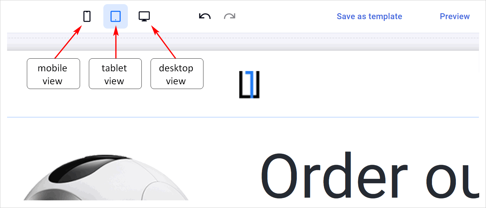
You can create unique elements and define custom properties for each display mode! In the settings of any Section, Row, or Element, use the Visibility toggle to hide or show it on specific devices. This allows you to build a custom, lightweight experience for your mobile shoppers.
 Saving, Previewing, and Templates
The top right corner of the toolbar holds your most important publishing tools.

-
Save: Click the green Save changes button frequently so you never lose your progress.
-
Preview: Click the Eye icon next to the save button to open a live preview of your page exactly as your customers will see it. (Note: Preview mode allows you to click buttons and test layouts, but it will not process real payments).
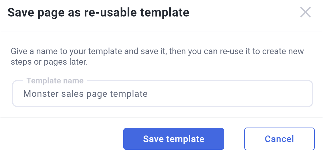
Saving Your Page as a Custom Template
If you built a beautiful layout and want to use it for future campaigns, you can save it as a reusable template! This creates massive consistency across your brand.
-
Click the Save as template icon (the floppy disk) on the top toolbar.
-
Give your custom template a unique name.
-
Click Save template.
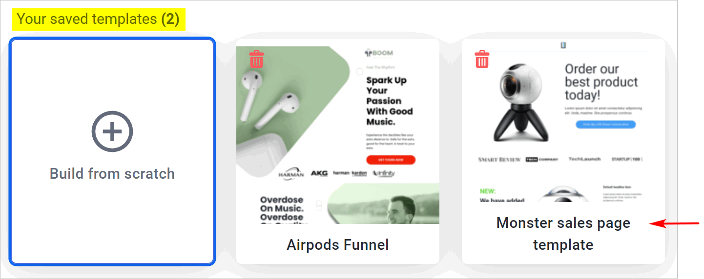
Reusing a Custom Template
The next time you build a funnel, your saved design will be waiting for you.
-
Go to your funnel dashboard and click Add new step.
-
Instead of browsing the default templates, scroll down to the Your saved templates heading.
-
Click your custom template to load it instantly!
 What’s Next?
Your page layout looks fantastic, but now it needs something to sell!
Read the next guide: Adding Products to Your Funnel