Hey everyone! ![]()
We spend a ton of time in this community sharing winning Templates and high-converting funnels. But honestly? Sometimes the best way to learn is by looking at what not to do.
I stumbled across this page for a Bulbasaur Resin Lamp. The product itself is actually awesome. Super niche, highly visual, great for ads. But the landing page? It’s a masterclass in how to accidentally burn your ad spend.
If your pages have any of these issues, you are definitely leaving money on the table. Let’s break it down (screenshots below!![]() ).
).
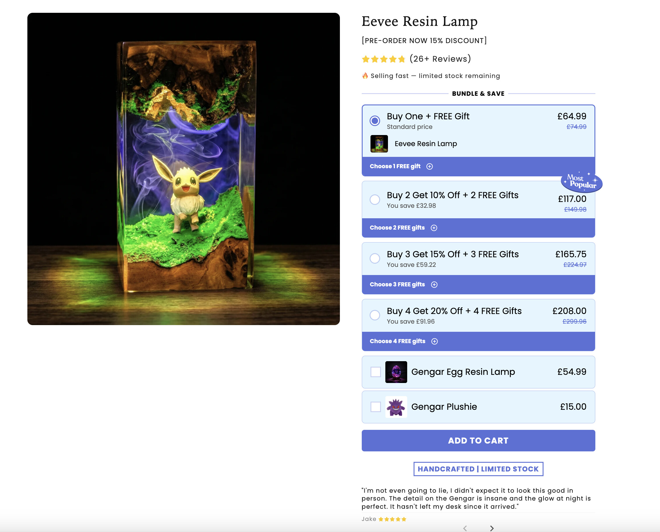
1. The “Wall of Chores” (Where is the buy button?!)
Take a look at this:
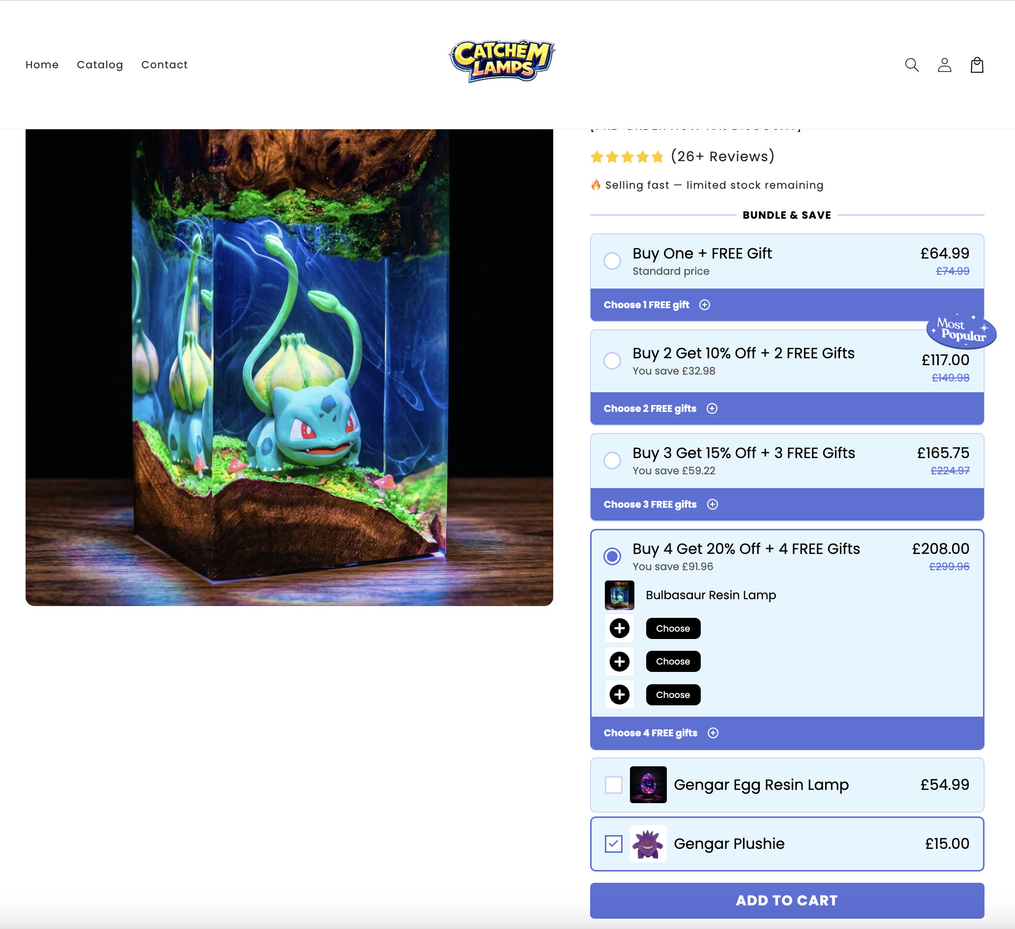
Must literally decrease the browser zoom to 75% just to see the “Add to Cart” button at first glance. For the sake of this teardown, I’ll do it. But a real customer? They won’t. They’ll just bounce.
Instead of a clean offer, you are immediately slammed with a massive wall of blue bundle boxes, radio buttons, and drop-downs. The actual “Add to Cart” button gets pushed so far down the page you have to hunt for it.
The Fix: Move your bundles to a post-purchase One-Click Upsell! Let them buy the main lamp with zero friction first, then offer them the 2-for-1 deal.
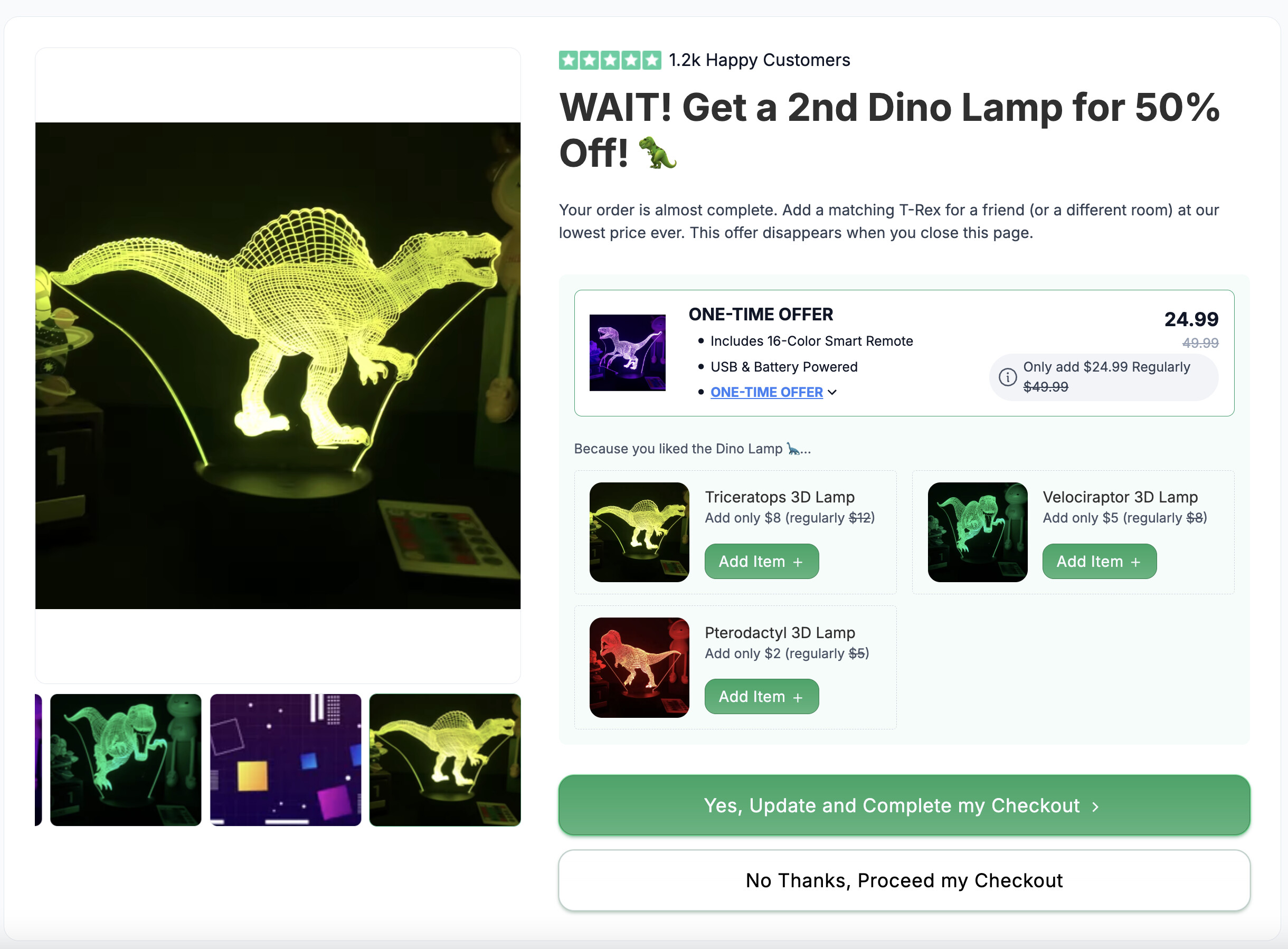
What changed here?
-
The timing: The bundle offer moved cleanly to a dedicated upsell page. This page comes right after the checkout step. They have already bought your main offer, and their credit card is securely on file! So they can add the upsell in one click, without having to re-add payment info.
-
Zero decision fatigue: Instead of doing mental math on a crowded product page, the customer just reads a single headline and clicks the big green “Yes” button to add the 50% off lamp to their order.
-
Frictionless add-ons: Want to cross-sell other variations? Look at those clean little impulse-buy boxes underneath. One click of “Add Item +” and the revenue goes up. No chaotic pop-up menus required.
Read more: How to structure a Downsell offer if customers reject your Upsell
2. The Pop-Up of Death 
Okay, so let’s say the user does click that “Buy 2” bundle. Look at the next screenshot. A giant modal pops up forcing them to scroll through and choose between 8 different Pokemon lamps.
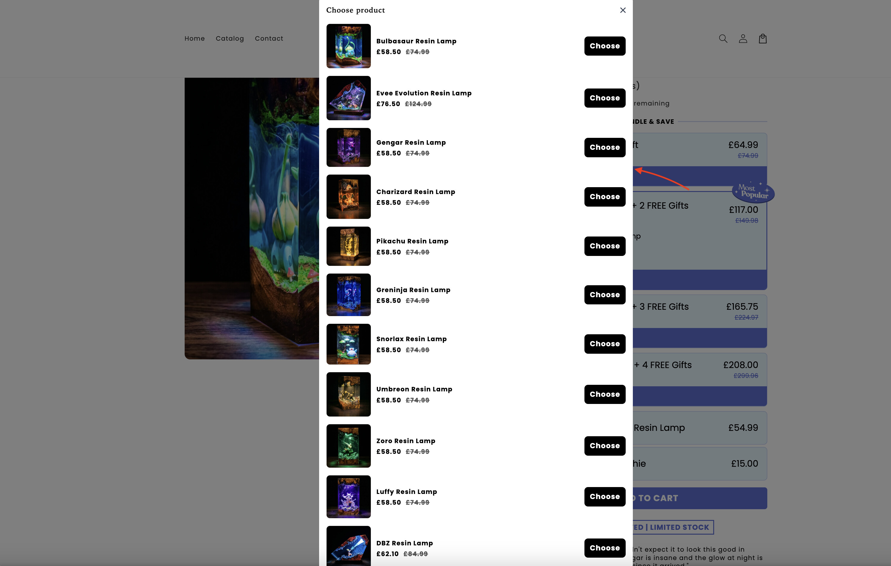
This is textbook decision fatigue. You took a buyer who was ready to checkout, interrupted them, and gave them homework. When forced to think too much, buyers just close the tab.
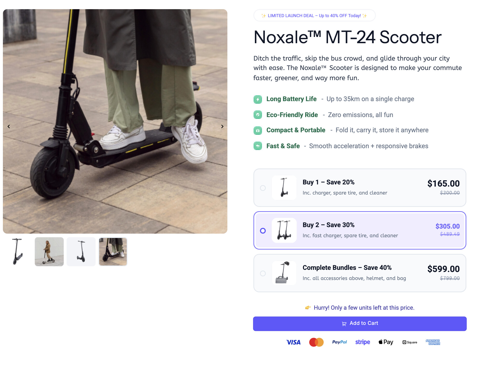
The Fix: If you run a bundle, keep it simple and clean. Make it an automatic duplicate of the same item, or offer one specific companion item on the next funnel step.
What changed here?
-
No intrusive pop-ups: The bundle selection happens directly on the page. The customer never loses sight of the “Add to Cart” button, and they aren’t slapped with a distracting overlay that completely hijacks their screen.
-
Pre-packaged simplicity: Instead of forcing the buyer to play match-maker and scroll through a dozen different variants to build their own bundle, the options are clearly defined (Buy 1, Buy 2, or the Complete Bundle).
-
Clear, immediate incentives: The tiered pricing and discounts (Save 20%, Save 30%) are baked right into the selectable boxes. They click the tier they want, click Add to Cart, and they are instantly at checkout. No homework required!
Read more: How to Build a High-Speed Page for 100+ Variants (The Shopify “Variant Bloat” Fix)
3. Zero Copy & No Trust
Let’s have a look at this:
There is no storytelling, no dimensions, no material details, just a barebones FAQ dropdown. You can’t assume a product sells itself just because it looks cool. Plus, there’s only one tiny text review and zero urgency. It feels like a store that could vanish tomorrow.
The Fix: Add a 30-day guarantee badge right next to the button. Swap the empty space for a GIF of the lamp glowing in a dark room, and add a few real customer photo reviews.
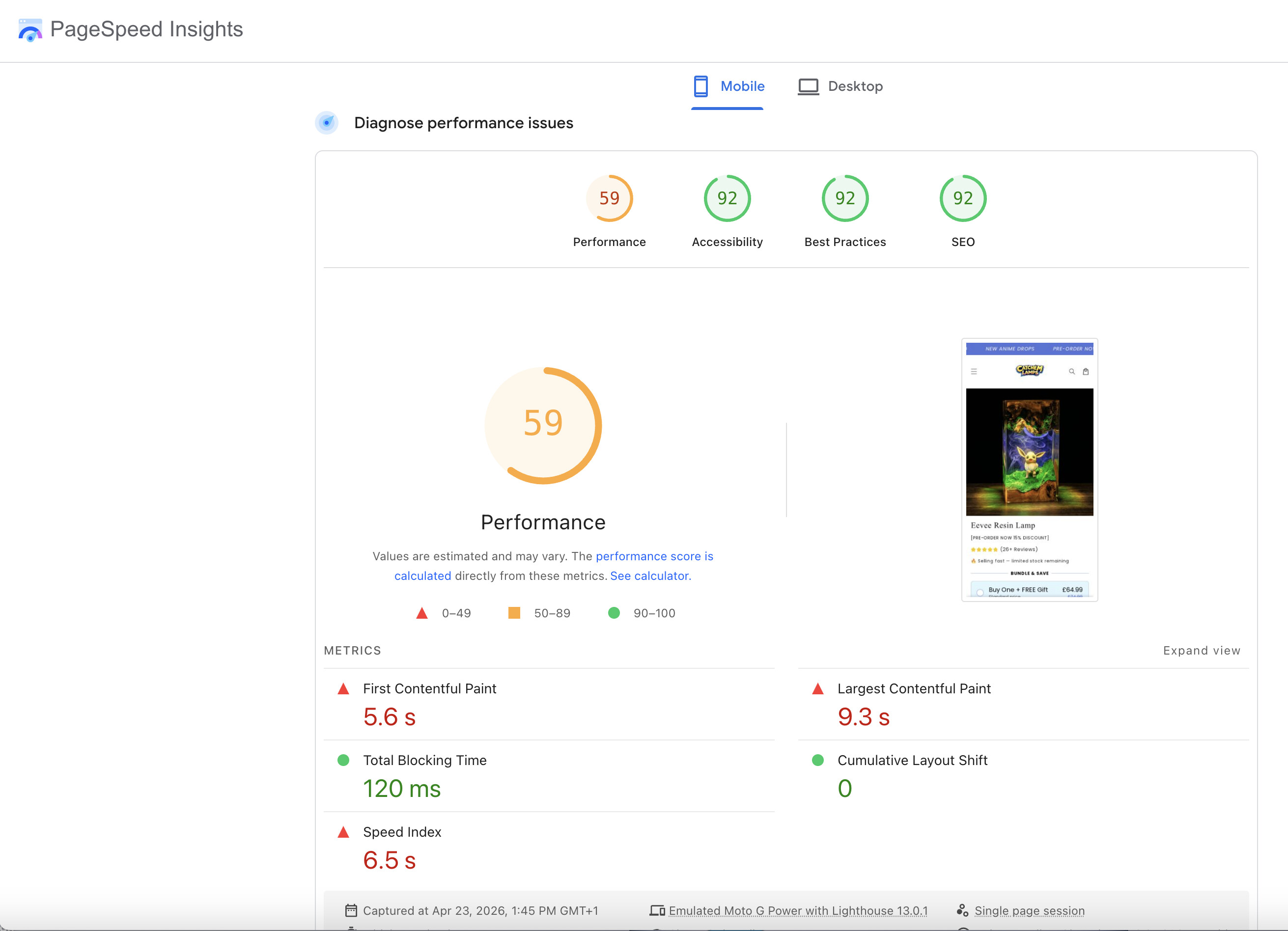
4. The Silent Killer (Awful Page Speed) 
I ran their mobile page through Google PageSpeed Insights, and the results are brutal. Look at the screenshot below.
A 59 overall performance score is bad, but the real crime here is the Largest Contentful Paint (LCP) at 9.3 seconds and the First Contentful Paint at 5.6 seconds.
That means when a customer clicks their Facebook or TikTok ad, they are staring at a blank white screen for over 5 seconds, and it takes almost 10 full seconds for the main product image to even load!
In the short-form video era, if your page doesn’t load in under 3 seconds, the customer is gone. You are literally paying lots for clicks, just for users to close the window before the site even renders.
Why does this happen, and how do you fix it?
-
The Bloat: This awful load time is the direct result of Mistake #1 and Mistake #2. When you stack your store with heavy, third-party bundle apps, pop-up scripts, and unoptimized themes, it chokes your mobile load speed.
-
The Funnel Advantage: This is exactly why we use dedicated funnels instead of standard store pages. A clean funnel has no heavy third-party app bloat. The bundling and upsell features are natively built into the page code, meaning it loads almost instantly. Faster load times = cheaper ad clicks and higher conversion rates.
 The Takeaway
Don’t let clunky store apps and bloated code ruin a winning product. Keep your pages lightning-fast, remove the friction, and guide the user straight to the checkout.
What do you guys think, would you have waited 10 seconds for this page to load, or would you have bounced?
![]() Got a question or want a page teardown? If you’re struggling with your conversion rate or want some honest feedback on your current landing page, feel free to drop your URL below or start a new thread in the Ask the community section.
Got a question or want a page teardown? If you’re struggling with your conversion rate or want some honest feedback on your current landing page, feel free to drop your URL below or start a new thread in the Ask the community section.
![]() Explore more templates: If you are ready to ditch the slow, bloated store pages and build a high-speed funnel, you can find conversion-optimized layouts, share your own designs, or request a specific page structure in our Templates category.
Explore more templates: If you are ready to ditch the slow, bloated store pages and build a high-speed funnel, you can find conversion-optimized layouts, share your own designs, or request a specific page structure in our Templates category.
![]() A Quick Disclaimer: Just to be completely clear, this post is purely an educational analysis from an e-commerce and Conversion Rate Optimization (CRO) perspective. We are not affiliated with this brand, nor are we commenting on the actual quality of their physical products (which, honestly, look amazing!). If you are a customer who stumbled on this post looking for a cool lamp, don’t let our tech-nerd marketing breakdown stop you from grabbing one!
A Quick Disclaimer: Just to be completely clear, this post is purely an educational analysis from an e-commerce and Conversion Rate Optimization (CRO) perspective. We are not affiliated with this brand, nor are we commenting on the actual quality of their physical products (which, honestly, look amazing!). If you are a customer who stumbled on this post looking for a cool lamp, don’t let our tech-nerd marketing breakdown stop you from grabbing one!