Most of your buyers are on a phone. A funnel that looks sharp on your monitor and cramped on mobile loses money, and you’ll never see it happen.
Funnelish handles this without a separate mobile editor. You build one page, then adjust individual properties per device where they need adjusting. This guide covers the whole system: display modes, responsive properties, per-device visibility, and what to check before you send traffic.
Display modes
The center of the toolbar switches the canvas between desktop, tablet and mobile.
This isn’t a preview toggle. The mode you’re in is the mode you’re editing. Change a font size in mobile view and you’ve changed it on mobile only; desktop keeps its own value. That single idea is the whole responsive system.
Responsive properties
Almost every property in the settings panel can hold a different value per device. Next to each one is a device toggle:
- All devices: one value everywhere.
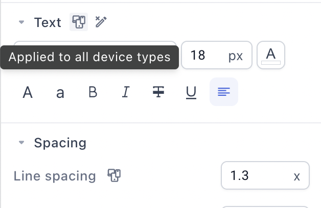
- This device only: the value applies to the device you’re currently editing.
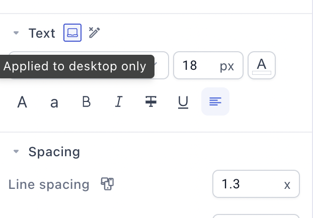
It works for font size and styling, text and element alignment, margins and padding, background colors, container and row orientation, min and max width and height, borders, shadows, and more:
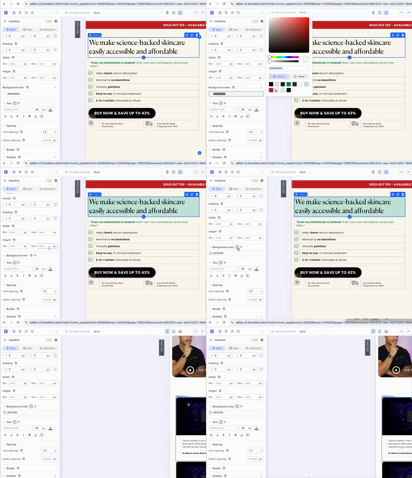
A worked example. Your hero image sits right-aligned on desktop, which looks wrong on a phone:
-
Switch the canvas to mobile view.
-
Select the image.
-
Change alignment to center.
-
Save changes.
Right-aligned on desktop, centered on mobile, one element.
How defaults carry over. Set a property in desktop view and Funnelish copies that value to tablet and mobile as the starting point. Adjust each device from there only where it needs it.
Some settings are behavior rather than styling and apply everywhere: carousel autoplay, loop and transition effect, timer durations and labels, sticky positioning, the Table of Contents heading levels. Set those once and they hold across devices.
The one property that changes layouts: orientation
Rows and containers have an orientation property, and it’s responsive. That’s the single most useful responsive setting in the builder.
A row of three feature boxes side by side on desktop becomes an unreadable squeeze on a phone. Switch to mobile view, set the row’s orientation to vertical, and the same three boxes stack. No duplicate elements, no hidden copies, same content.
Reach for this before anything else when a section doesn’t fit on mobile. More on layout structure in Sections, Rows & Containers.
Show and hide per device
Every element, row and section can be shown or hidden per device from the Responsive section of its settings:
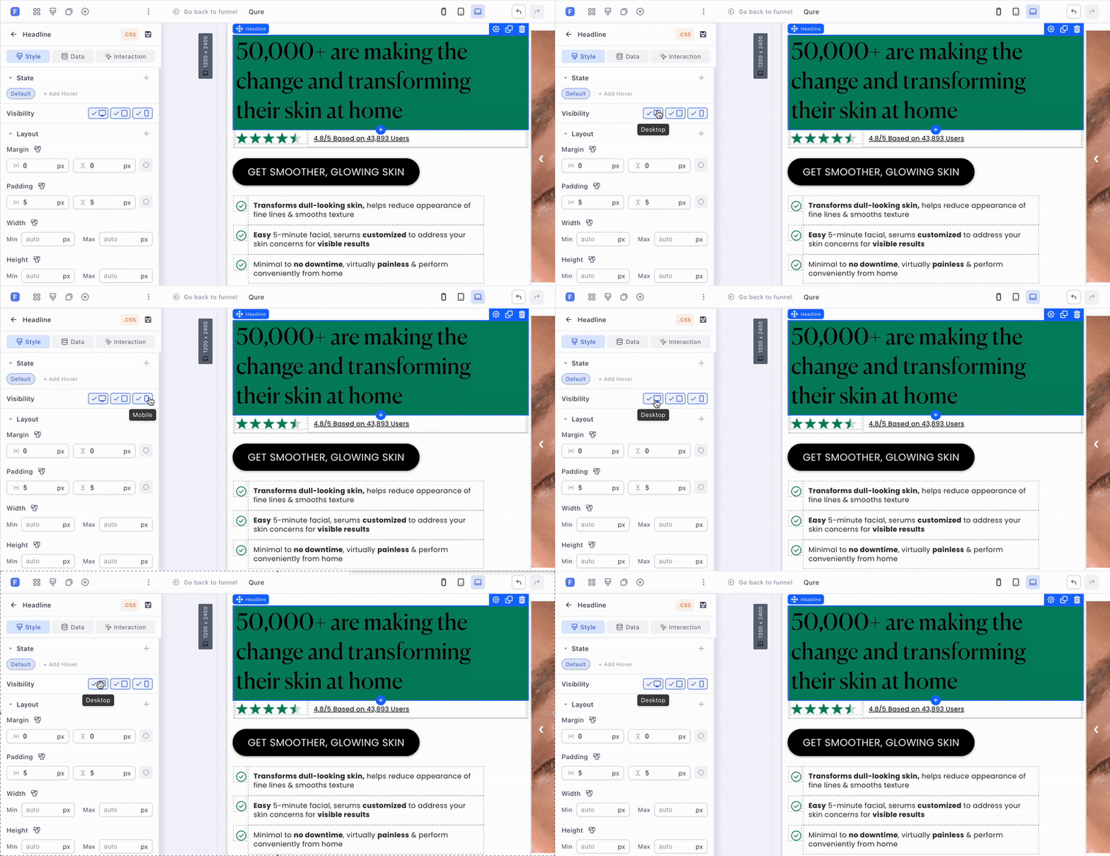
Useful for a decorative desktop banner that adds nothing on mobile, or a compact mobile-only header.
Use it sparingly. Two hidden copies of the same block means two blocks to keep in sync, and the forgotten one is always the mobile version. Most layouts that seem to need duplication just need a different orientation or a per-device padding value. Hidden elements still load, so this isn’t a speed optimization either.
When you genuinely need different layouts
A few things can’t vary by property alone. Custom HTML is the clearest case: alignment and margins can differ per device, but the HTML itself can’t. When you truly need two versions:
-
Build the element for the first device, then in Responsive turn on the devices it should appear on (desktop on, mobile off).
-
Duplicate it and set the opposite visibility (mobile on, desktop off).
-
Edit the duplicate for its device.
-
Save changes.
That’s the escape hatch, not the default approach.
Before you publish
Walk the page in mobile view and check:
-
Headlines: desktop sizes are almost always too big on a phone. Drop them a few steps in mobile view.
-
Rows that should stack: any row of two or more columns.
-
Padding: generous desktop spacing eats a phone screen. Tighten it.
-
The CTA: reachable without a long scroll, and wide enough to tap with a thumb.
-
Images: not cropping the important part, not forcing a horizontal scroll.
-
The checkout: the form and payment button in mobile view, since that’s where the money is.
Then preview in a real browser and open it on your actual phone. The canvas is accurate, but nothing beats holding the page you’re asking people to buy from.
Related articles
Got a section that refuses to behave on mobile? Post a screenshot in Ask the community, this is the most common builder question and usually a one-setting fix.