Every Funnelish page is built on the same skeleton: sections are the base, each section holds rows, each row has one or more columns, and inside go your elements or containers. Get this structure right and everything else snaps into place. This guide covers all of it, plus spacers.
New to the editor? Start with the Page Builder overview.
Add a section
Sections are full-width bands stacked top to bottom, hero, offer, testimonials, footer. The first thing on any page should be a section; everything else lives inside one.
On a blank page:
-
Click the plus (+) icon on the empty canvas
-
Choose the section width: full width, wide, or half-width
The new section is empty. Rows and columns come next.
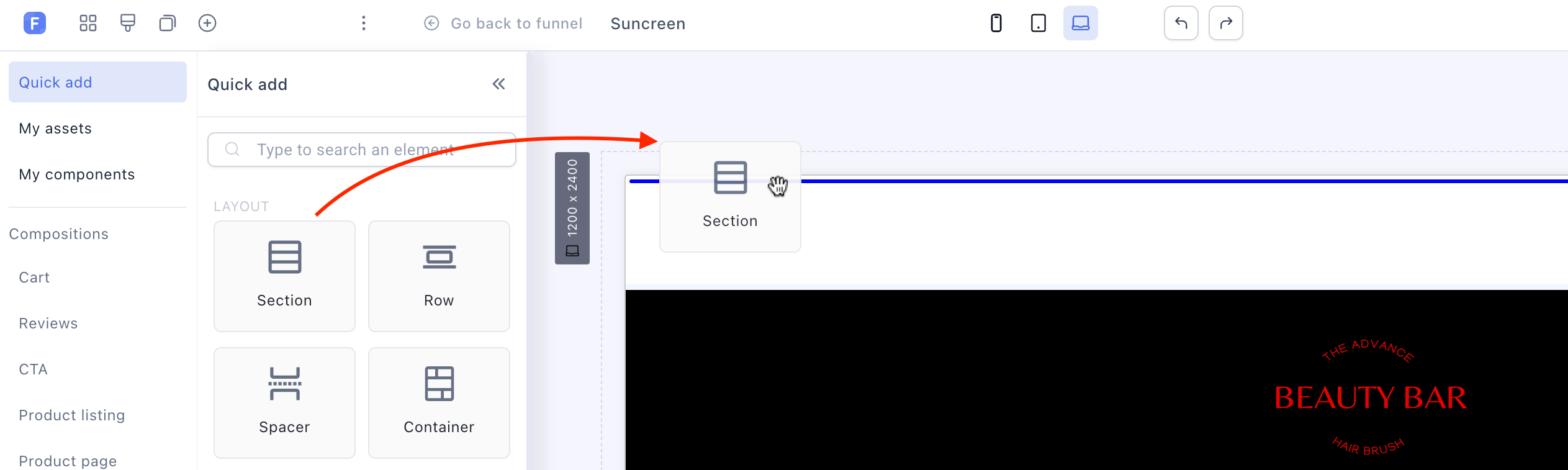
On an existing page: drag the Section widget from the elements panel to wherever it should go, and release.
Add rows and columns
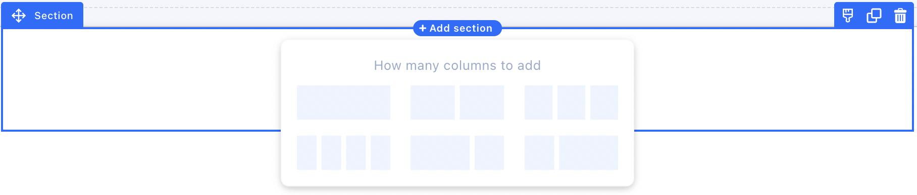
Click Add New Row inside a section, and you’re asked how many columns the row should have:
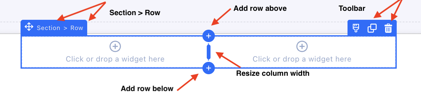
Hover any part of the page to see the hierarchy, each level (section, row, element) gets its own toolbar to edit, clone or delete it. The blue plus circles add a new row above or below the current one, and you can also drag a Row widget straight onto the canvas.
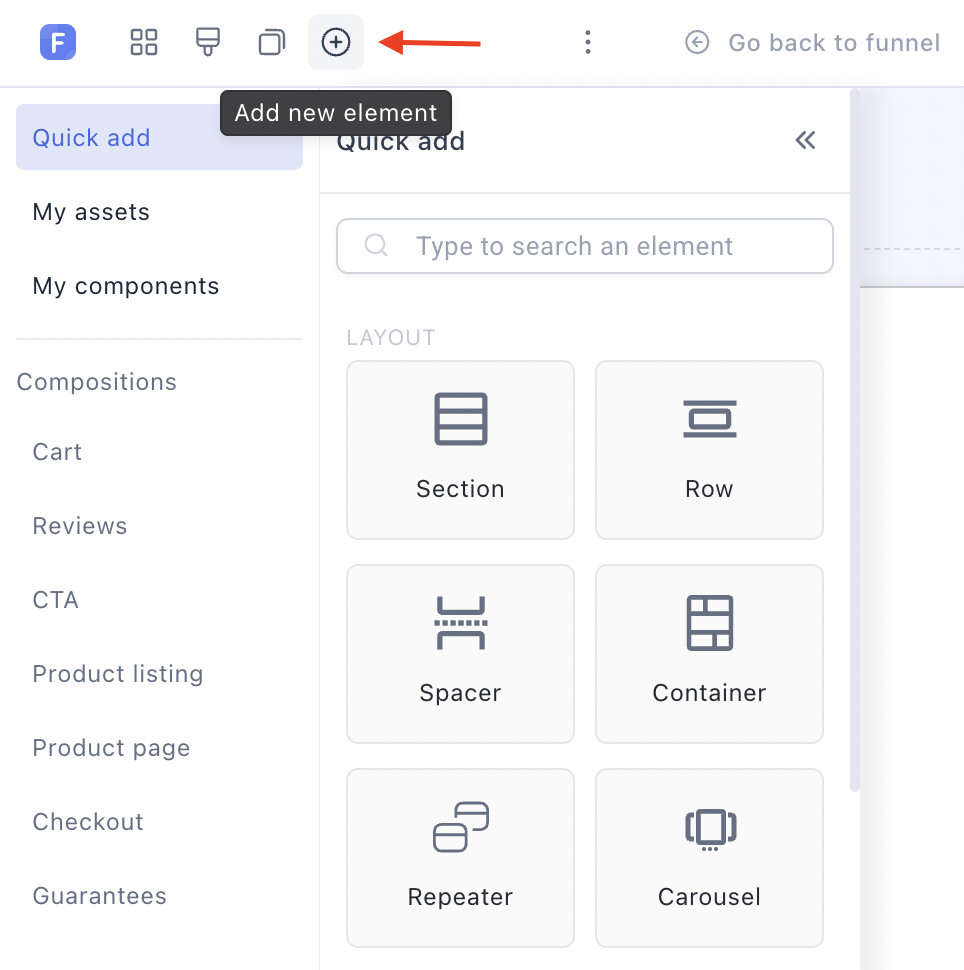
All the layout widgets live in the Add new element panel:
Containers: the workhorse
A Container is an empty, transparent box that can hold anything: text, images, buttons, forms, other containers. It’s the most flexible element in the builder, and the one to reach for when you’re not sure how to build a layout.
What makes containers powerful is that every layout property is responsive: padding, margins, alignment, orientation and widths can differ per display mode. One container can lay its content out horizontally on desktop and stack it vertically on mobile, no duplicate elements needed.
Add a container:
-
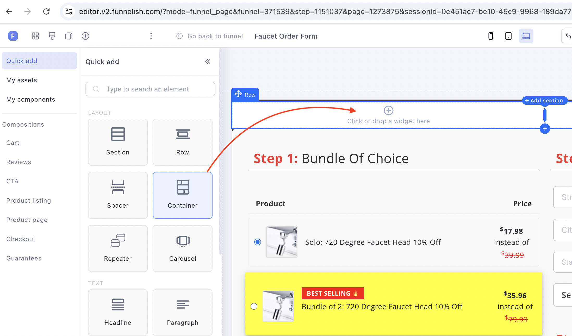
Click the plus (+) icon inside a row cell, a blue line connects the cell to the elements panel
-
Click Container, it lands in the cell and opens its settings
Boxes: structure inside a container
Boxes stack elements inside a container, horizontally or vertically, with precise widths, margins and alignment per box.
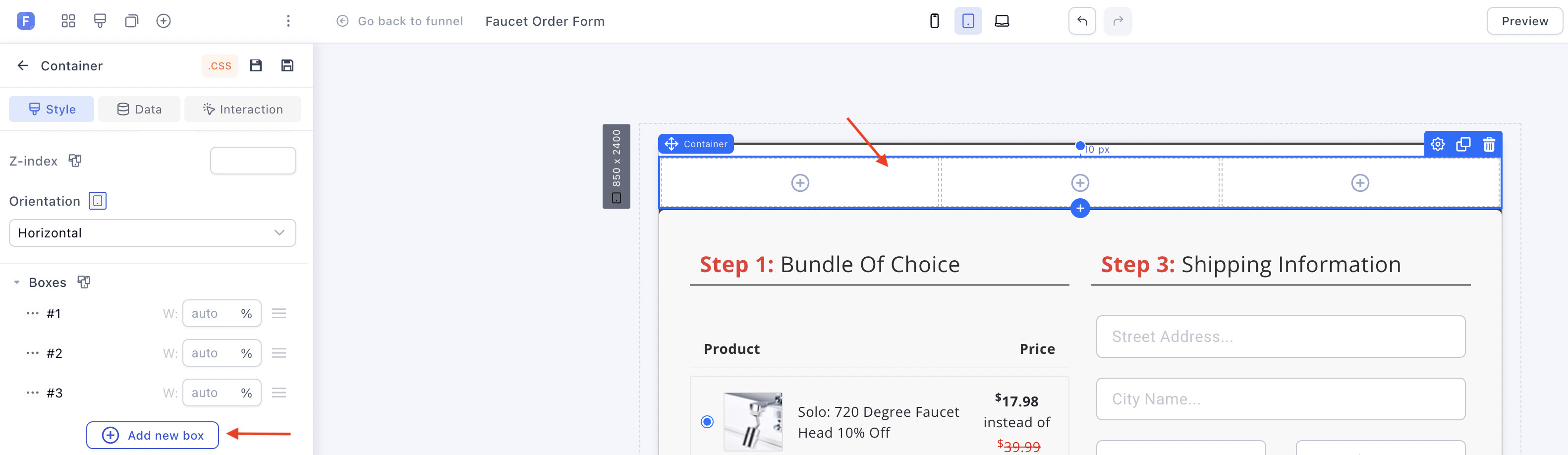
- Select the container, then click Add new box in the side panel, you get two equal-width boxes to start
-
Add more boxes with the same button; delete one via the ellipsis next to its name
-
Set the boxes’ orientation (horizontal or vertical) from the side panel:
Fill the boxes
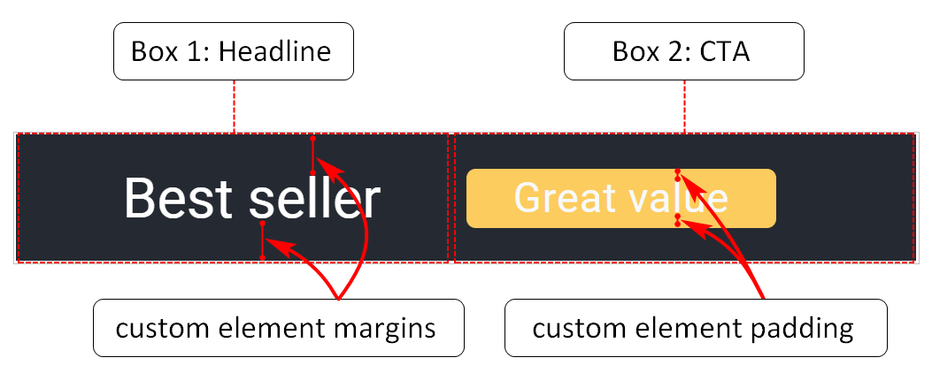
Click a box, pick a widget from the panel, customize, repeat per box, then save and preview:
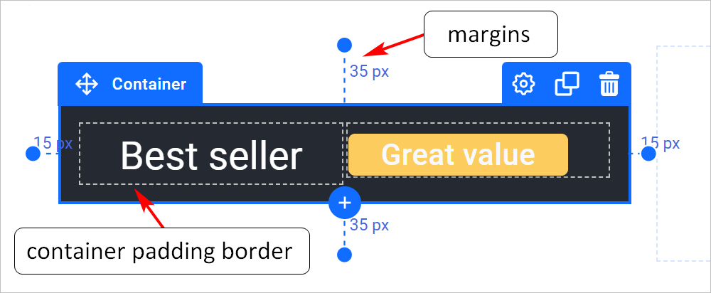
Container size and position are controlled with margin and padding settings:
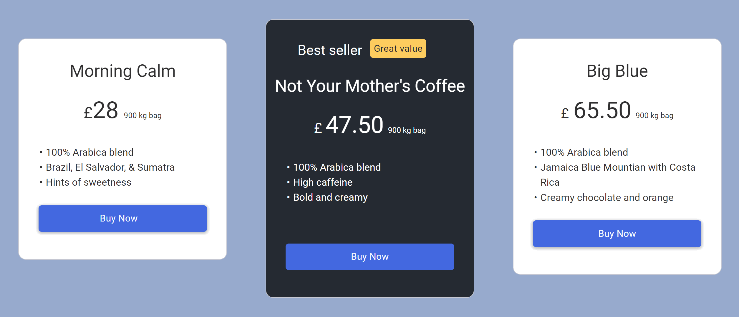
Put together, containers and boxes build anything, this pricing table is nothing but containers, boxes and basic elements:
Spacers
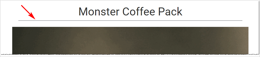
The Spacer widget creates separation between elements: drag it in, then configure margins, padding, width, color and border style. Like everything in the builder it’s responsive, untick a device in its settings to hide it there.
Keep learning
-
Page Builder overview: the map of the whole editor and every element
-
General Settings & Page Properties: the toolbar, display modes and templates
-
Don’t want to start from a blank page? Clone a ready-made funnel from Templates
 Questions about layouts? Reply below or ask in Ask the community.
 Missing an editor feature? Suggest it in Feature requests — the most-voted requests shape the roadmap.