Every page in Funnelish is built with one editor: funnel steps, blog pages, store pages and customer portals all use the same drag and drop page builder. Learn it once and you can design anything on the platform, and anything you build can be saved and reused everywhere else.
This page is the map of the builder. Each element links to its full guide.
Open the editor
- Click Funnels in the top menu bar and open your funnel
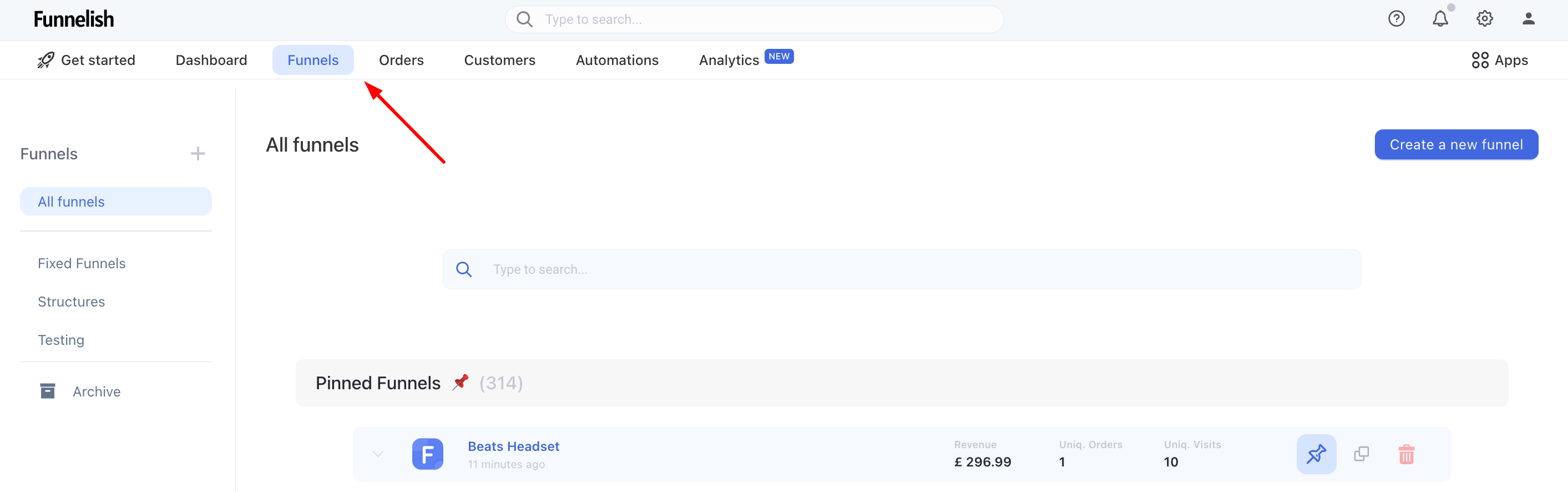
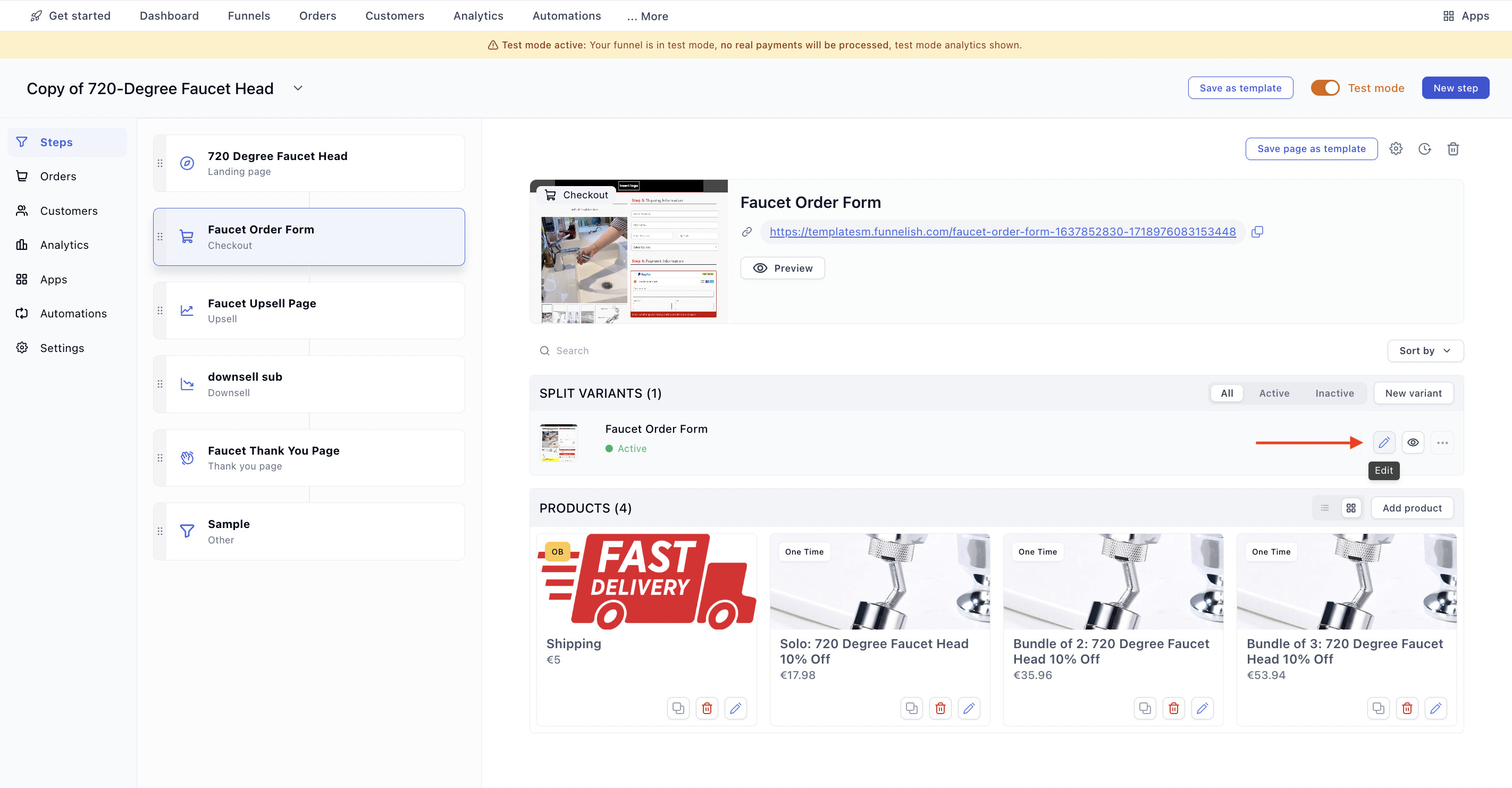
- Click the step you want to edit, then click Edit page
- The editor opens: elements panel on the left, your page in the middle, settings for the selected element on the right. Pick a display mode (desktop or mobile) and start dragging elements onto the page
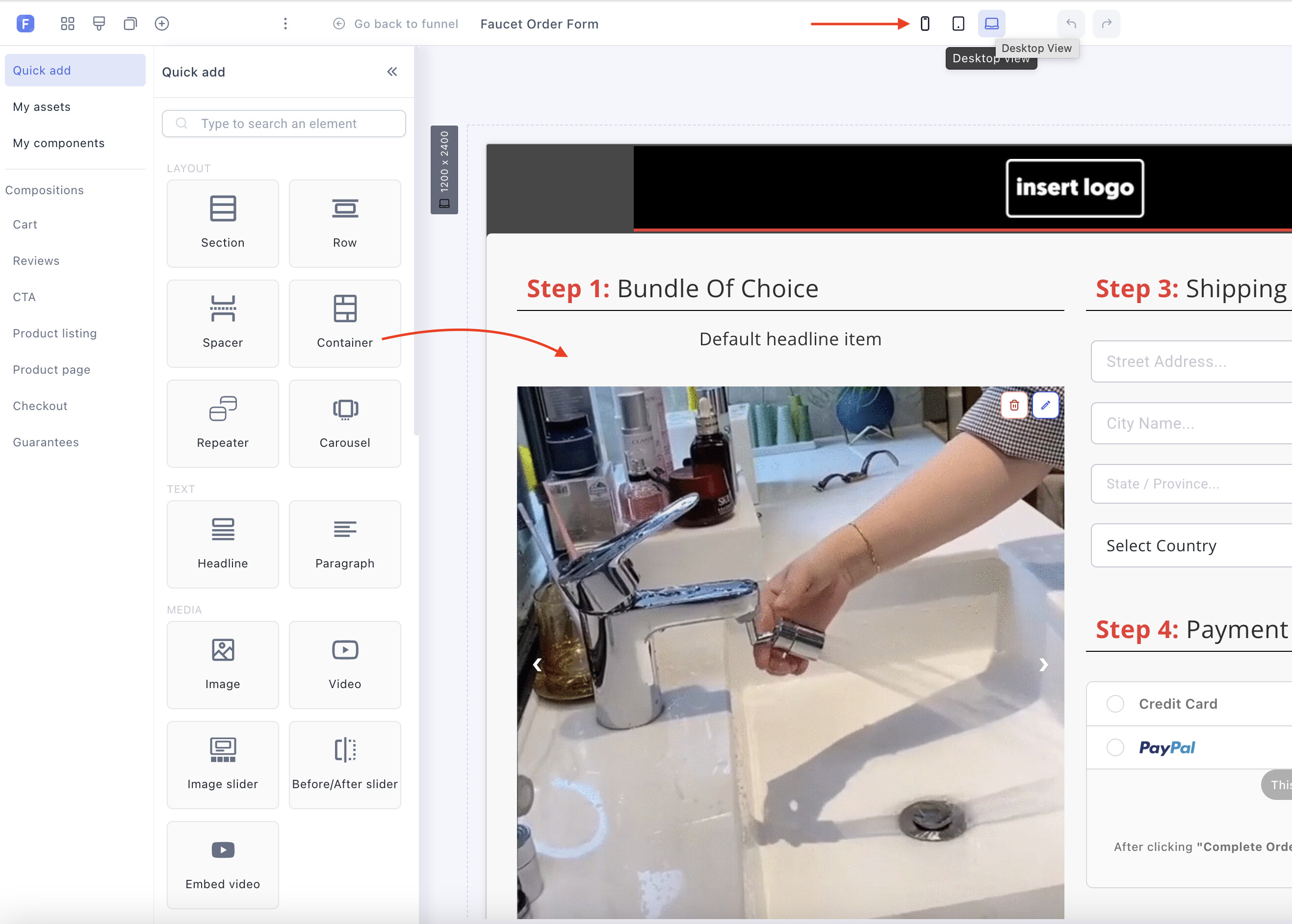
The same editor opens from blog pages (Blogs → your blog → edit a page), store pages and customer portals.
How pages are structured
Every Funnelish page follows the same hierarchy:
-
Sections are the base of any page: full-width bands stacked top to bottom. Hero, offer, testimonials, footer, each is a section.
-
Each section holds rows, and each row has one or more columns.
-
Inside go your elements (text, images, buttons, forms) or containers.
-
Containers are the workhorse of a Funnelish page. They group anything, nest inside each other, and every layout property is responsive, so one container can lay out horizontally on desktop and stack vertically on mobile. When you’re unsure how to build a layout, the answer is usually a container.
Two habits that make everything easier:
-
Every element has settings. Select any element and its options appear in the side panel: content, style, spacing, visibility.
-
Check mobile before moving on. Switch the display mode to mobile and fix anything that broke. Most of your traffic is on phones; treat the mobile view as the primary one.
Elements reference
Layout & structure
-
General Settings & Page Properties: the toolbar, display modes and page-level options
-
Layout & Containers: sections, rows, columns and containers, the page skeleton and its responsive properties
-
Compositions & Saved Assets: drop in pre-built blocks, and save your own for reuse across all your funnels
-
Repeater & Carousel: repeating content and slideshows
Checkout elements
-
Payment Forms: the payment form and the 2-step form that collects shipping and payment in one template
-
Product List: display your offer and its variants, or build custom product lists with data binding
-
Order Bump: the last-minute add-on offer at checkout
-
Order Summaries: show the cart contents and totals
-
Form Fields: custom fields on any form
-
Express Checkout: Apple Pay, Google Pay and PayPal Express buttons, straight from the editor
Content & conversion
-
Text & Media: headlines, paragraphs, images and video
-
CTA Buttons: buttons and links that move buyers to the next step
-
Popups: exit intent and triggered overlays
-
Countdown Timers & Progress Bars: urgency and journey guideposts
-
FAQs & Social Buttons: expandable answers and share buttons
Build once, reuse everywhere
Anything you build can become a Shared Component: save a header, a guarantee block or a whole section once, and drop it into any funnel, blog or store page. Update the component in one place and every page using it updates too. For one-off reuse, save any element set as an asset and pull it from the Compositions panel.
Keep learning
-
Using the Drag-and-Drop Builder: the hands-on tutorial for your first page
-
Configuring the Checkout Step: where the checkout elements come together
-
Funnelish Quick Start Guide: the full launch path
Questions about the builder? Reply below or ask in Ask the community.