The Form element adds custom fields anywhere on a page: opt-ins, checkout details, surveys, checklists. One setting decides whether a field actually does anything, its Data type, which wires the input to the customer record so automations, integrations and later steps can use it. Get that part right and the rest is styling.
New to the editor? Start with the Page Builder overview.
Add a form element
Drag the Form element widget onto the page, then pick its Input type in the side panel, seven types cover everything:
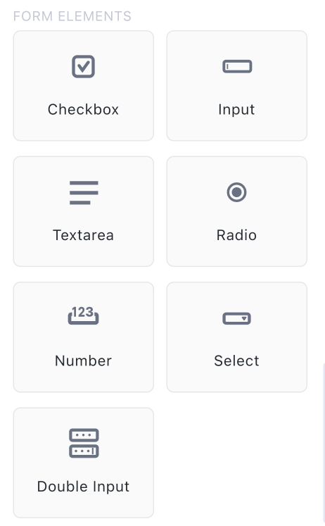
The input types
Checkbox: confirmations and consents (“I agree to the terms”), with an optional required asterisk. Also the building block for multi-select product entries (more below).

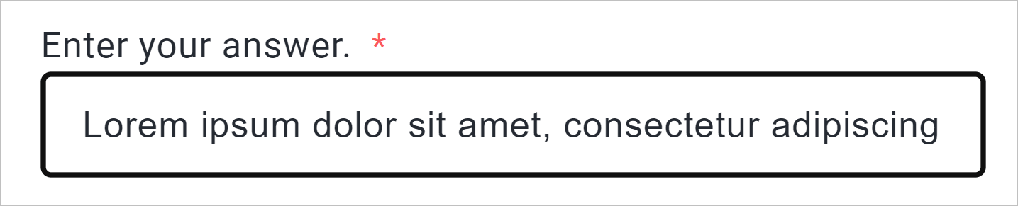
Input: the standard single-line field for short answers, names, emails, phone numbers.
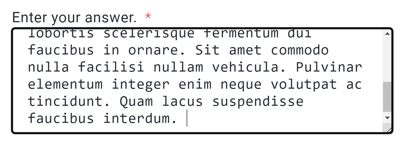
Textarea: a multi-line box for longer answers, special instructions, feedback.
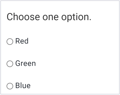
Radio: pick-one options. To add more choices, select the radio on the canvas and click Clone FormElement in its blue toolbar, then edit each option’s text. Give radios that belong together the same radio group name so picking one clears the others.
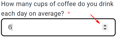
Number: numeric input with increment/decrement arrows.
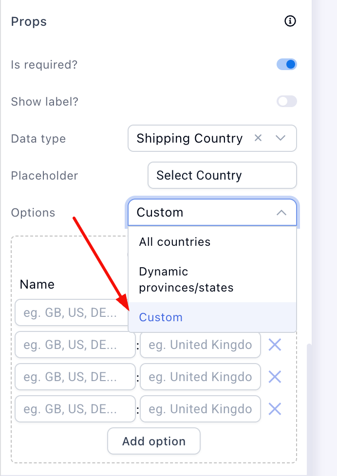
Select: a dropdown. It defaults to All countries; under Props → Options you can switch to:
- Custom: your own list. Click Add option, set the Name (internal identifier) and Value (what buyers see), repeat per option
- Dynamic provinces/states: a second dropdown that updates itself based on the country picked in another select. Pair it with an All-countries or Custom country field, set this field’s Data type to a state/province type, and preview to watch it follow the country
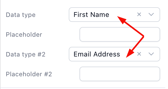
Double input: two fields side by side in one element, name + phone, city + zip. Set Data type and Data type #2 under Props, one per field.
The props that matter
Every form element’s Props section in the side panel:
-
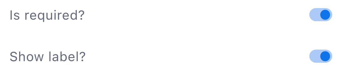
Is required?: the buyer can’t continue without filling it
-
Show label?: the field’s title above it, toggle off for compact forms where placeholders do the work
Data type: the setting that makes fields real
Data type maps the field to the customer record: email, first name, last name, phone, address, city, state, zip, country, or a custom field you’ve configured.
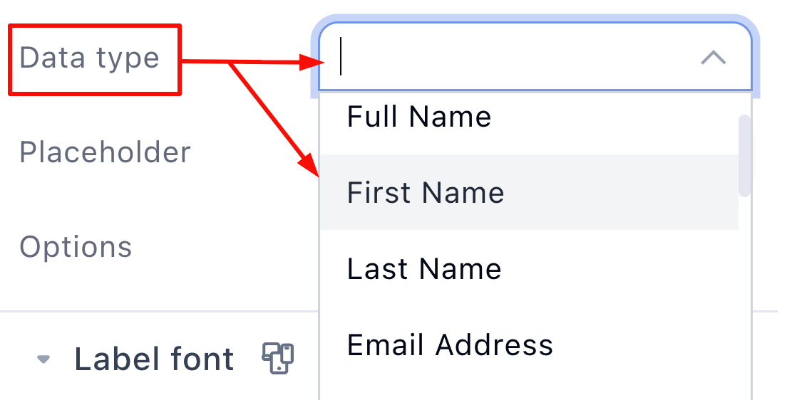
A field with Data type Not set is decorative: its value doesn’t join the customer profile, doesn’t carry to the next step, and never reaches your automations, webhooks or CRM. If a customer detail “isn’t coming through” anywhere in Funnelish, this is the first thing to check.
Placeholder
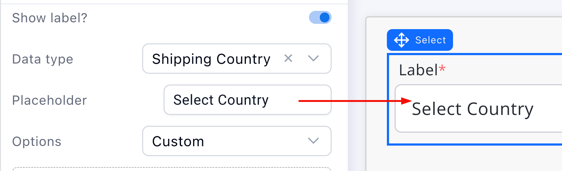
The hint text inside the empty field (“[email protected]”). Use it to show the expected format rather than repeating the label.
Form fields as product selectors
Two special jobs on checkout pages:
-
A radio bound to Product ID turns any container into a pick-one product selector, same radio group across the options
-
A checkbox inside a product-bound container makes it multi-select, add several products at once
The full pattern is in Product Lists → custom lists with data binding.
Don’t rebuild address forms
Shipping and billing address collection, including the “Same as shipping address” toggle, ships pre-built in Compositions, containers and form elements with data types already assigned. Drag it in and edit, instead of assembling ten fields by hand. See Compositions & Saved Assets.
Preview and test
Preview the page and fill your own form: required fields should block, the country/state pair should cascade, and after submitting, the details should appear on the customer record. If a value is missing there, check its Data type.
Keep learning
-
Page Builder overview: the map of the whole editor and every element
-
Payment Form: the payment side of the checkout your fields feed
-
Compositions & Saved Assets: pre-built address and checkout blocks
-
Funnelish Automations: put the collected data to work
-
Want forms already wired up? Clone a funnel from Templates
 Questions? Reply below or ask in Ask the community.
 Missing an editor feature? Suggest it in Feature requests — the most-voted requests shape the roadmap.