The Express Checkout element puts wallet payment buttons on your checkout page: Apple Pay, Google Pay and PayPal Express. Your customer taps the button, approves in the wallet sheet with Face ID or a fingerprint, and the order is placed. No card form, no typing. On mobile, where most funnel traffic is, this is the single biggest friction remover you can add to a checkout.

This article covers the element itself: where to place it, what you can style, and how to design the rest of your page around wallet buyers. For gateway requirements, enabling express checkout, testing and troubleshooting, see Express checkout setup.
Before you add it
Two things need to be in place, otherwise the element renders nothing:
-
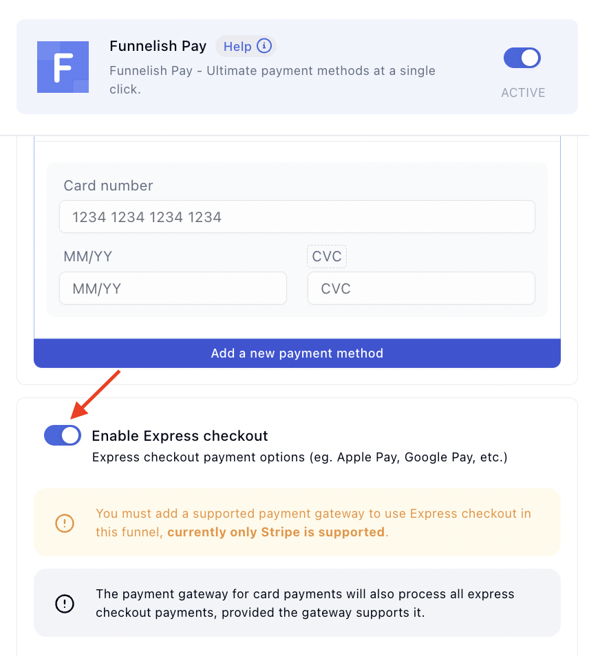
Express checkout enabled on the funnel. Select your payment form and click Edit payment options, or go to Funnel → Apps → Funnelish Pay, then toggle Enable Express checkout on.
-
A gateway that supports wallet payments. Gateways are connected once for your whole account. Apple Pay and Google Pay run through Stripe, PayPal Express comes through your PayPal connection. The setup guide has the current availability list.
Add the element
You’ll find Express Checkout in the elements panel under Forms. Drag it onto your checkout page:
Placement notes:
-
Above the payment form is where wallet buyers expect the buttons. They scan for the Apple Pay or Google Pay mark before they consider typing a card number.
-
The element goes on the checkout page only. Steps after the checkout charge the same wallet through one-click upsells automatically, so your upsell and downsell pages don’t need it. See Payment Form.
-
The toggle alone shows nothing. If the element isn’t on the page, no wallet buttons appear anywhere, however correctly the payment options are configured. The reverse is also true: the element without the toggle stays empty.
What you can style, and what you can’t
The buttons themselves aren’t yours to design. Apple Pay, Google Pay and PayPal render their own buttons to their brand guidelines, and that instant recognition is exactly what makes visitors trust and tap them.
The element around the buttons styles like any other:
-
Margin, padding and min/max width or height to fit your layout.
-
Background color and shadows to frame the buttons, for example a soft card behind them.
-
Sticky positioning if you want the buttons to stay in view while the page scrolls.
-
Per-device visibility. Like any element, you can show it on mobile and hide it on desktop, or the other way around. Wallet buttons earn their spot most on mobile.
Buttons appear only when they work
Express checkout buttons are conditional by design. A button renders only when that wallet is genuinely usable for the visitor in front of it, which is also the guarantee that a shown button never fails on tap:
-
Apple Pay appears in Safari on Apple devices with a card in Apple Wallet.
-
Google Pay appears in Chrome and Android browsers with a card saved to the visitor’s Google account.
-
A visitor with no wallet set up sees no buttons at all, just your normal payment form. Nothing looks broken.
So if you don’t see the buttons on your own machine, that’s almost always the conditional display, not a fault. Preview the page on a phone with a wallet configured. More in the setup guide.
Let the wallet collect customer details
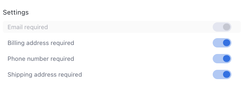
In the express checkout settings you choose what the wallet must hand over along with the payment:
-
Email required
-
Billing address required
-
Phone number, if you need it for fulfilment or SMS
Everything the wallet collects is data your customer didn’t have to type. If express checkout is on, keep your own form fields short rather than asking for the same details twice.
The shipping address is collected by default whenever the funnel uses shipping options:
Design the page for wallet buyers
A wallet payment is a different checkout experience, not a faster version of the same one. The customer taps, approves in the wallet sheet, and is done, without reading the rest of your checkout page. Plan for that:
-
Order bumps are likely to be missed. A bump next to the card form converts because people look there while typing card details. A wallet buyer never looks there. If bumps are a big share of your average order value, weigh that against the conversion lift.
-
Shipping options work inside the wallet sheet, so they become your bump substitute. Attach a faster-delivery fee to any product, or connect a shipping option to a hidden product to push an extra offer wallet buyers actually see.
-
Post-purchase upsells still work normally. The wallet only replaces the payment step, so one-click OTOs after the checkout are the safer place to make extra margin on wallet buyers.