Text and media elements are the content layer of every funnel page: the headlines people read, the product photos they look at, the videos that sell for you. This article covers the Text group (Headline, Paragraph, Table of Contents) and the Media group (Image, Video, Embed Video, Media Carousel, Before/After Slider).
Headlines and Paragraphs
The two text elements split the job. Headline is for titles and section headers: simple text with basic formatting. Paragraph is for everything else: longer copy with richer formatting, inline links, even images inside the text.
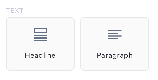
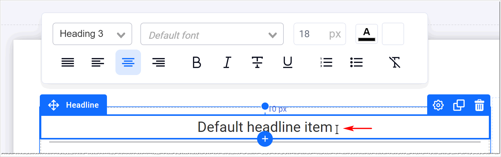
Drag one onto the page and click it once to edit the text in place. The inline toolbar handles size, alignment, color, bold and links:
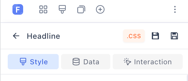
The left panel goes deeper, in three tabs:
-
Style: font, line height, letter spacing, background, borders, text shadows, and a separate hover state.
-
Data: bind the text to live data, like a product name or price, or a blog post title, with a fallback for when the data is empty. See Repeater & Carousel for how datasets work.
-
Interaction: run an action when the element is clicked or hovered. The available actions are listed under click actions below.
Table of Contents element
The Text group also holds a Table of Contents element. It builds a clickable list from the headings already on your page, so you never maintain it by hand:
-
Choose which heading levels to include, from H1 down to H6.
-
Render it as a numbered list, a bulleted list, or plain links.
-
It highlights the section the reader is currently in as they scroll.
-
By default it scans the whole page (on blog posts, the post body). Point it at a specific element instead to only index the headings inside it.
Use it on long-form pages: blog posts, advertorials, policy pages.
Image element
Drag an Image element in, then click Browse to pick the file. The library keeps your uploads in My Images, organized into folders, and includes a built-in Pexels search for royalty-free stock photos:
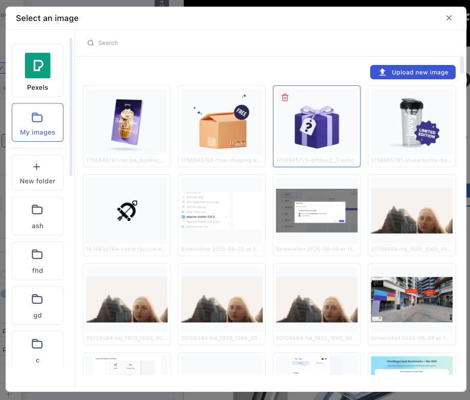
The settings panel covers the standard controls: width and height, max width, fit mode (cover, contain, scale down, fill), alignment, borders, shadows, and alt text, which you should fill in for SEO and accessibility. Lazyload is on by default, so images load just before they scroll into view. Leave it on.
Two features are worth knowing beyond the basics:
-
Preview selected product: the image swaps to show whichever product the customer has selected. Pair it with a Product List so the photo always matches the offer being bought. Turn it on in the image’s Basic settings.
-
Data binding: bind the image to a product image or blog post cover instead of a fixed file, with a fallback image if the data is empty.
Click actions
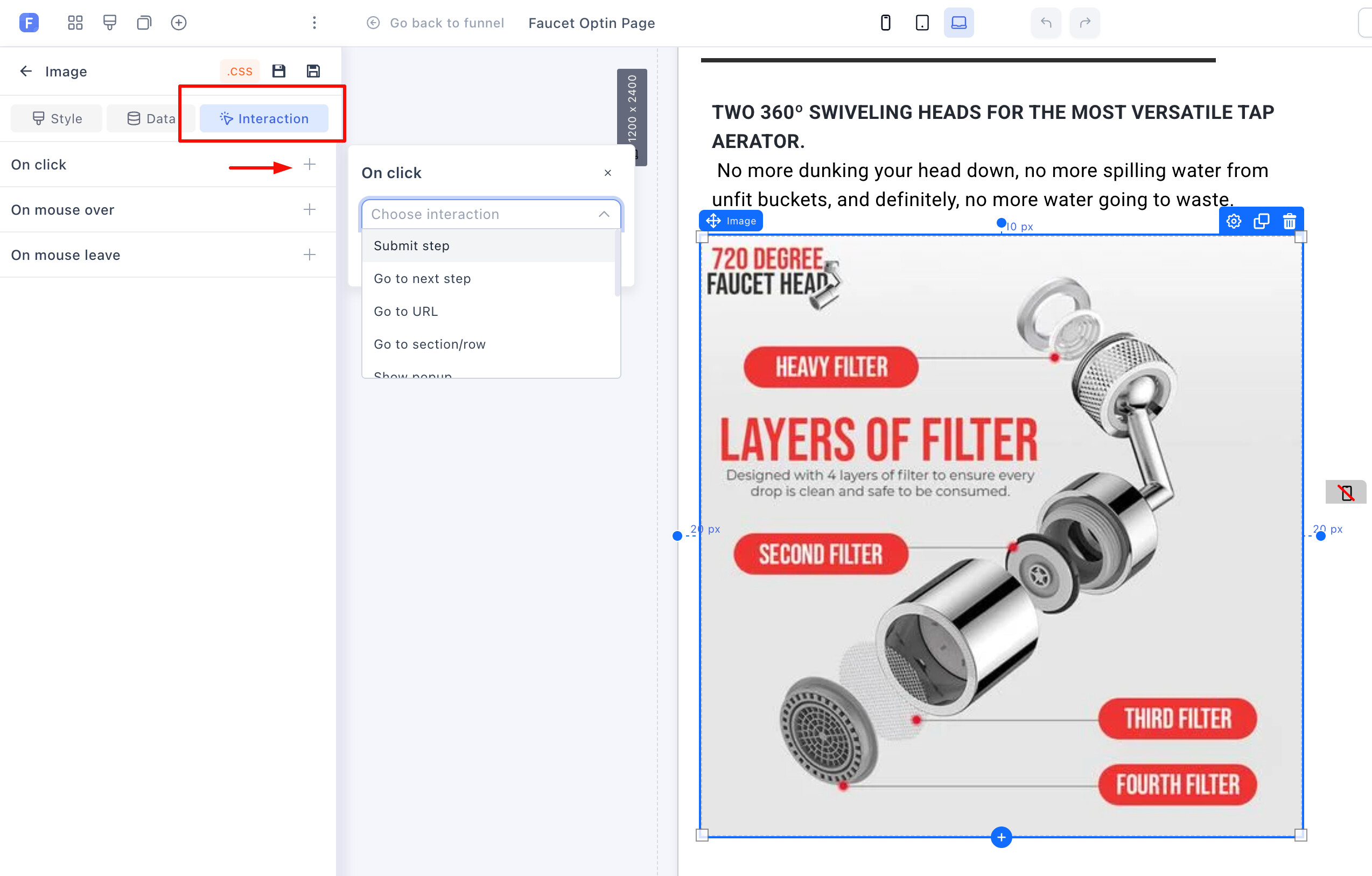
Text, images, videos and containers all take actions from the Interaction tab. Click the + next to On click:
-
Submit step: submit the customer’s details and move them to the next step.
-
Go to next step: move forward without submitting anything.
-
Go to URL: link to any external page.
-
Go to section/row: an anchor link to another place on the same page.
-
Show popup: open one of the page’s popups. A product image that opens a size chart, or a testimonial screenshot that opens a video, are one click action away.
Media Carousel
The Media Carousel is a swipeable set of slides with a thumbnail strip underneath, made for product galleries:
-
Native mobile swiping. Visitors slide through images with their finger, no custom code.
-
Customizable navigation arrows: style, color, size and position are all yours to set in the element settings.
-
Each slide is a container, so slides can hold anything, not just images. Autoplay, loop and transition effects work the same as the carousel covered in Repeater & Carousel.
You may still see the older Image Slider element in existing funnels. It’s deprecated: for new builds, use the Media Carousel.
Before/After Slider
The Before/After Slider shows two images with a draggable divider between them, so visitors compare the transformation themselves:
To set one up:
-
Drag the Before/After Slider from the Media group onto your page.
-
In the settings panel, set the Before and After images from your library. Use two photos with the same framing, the effect collapses if the shots don’t line up.
-
Adjust the labels. Show labels toggles them, the text is editable (say, “Week 0” and “Week 6”), and the label font, color and background color are all styleable.
-
Set the divider color so the handle stays visible against both photos.
-
Size and style it like any image: width, height, alignment, borders, shadows. Lazyload is on by default.
It earns its spot anywhere the product produces a visible change: skincare, teeth whitening, detailing, cleaning, fitness.
Video element
The Video element hosts the file on Funnelish and streams it from a premium streaming CDN with lazy loading, so even long, high-quality videos have little to no impact on page load speed. It’s the element we recommend for almost every video on a funnel page:
-
No third-party branding, no suggested videos at the end pulling people off your checkout.
-
Better than GIFs too: a short looping video is higher quality and lighter than the same clip as a GIF.
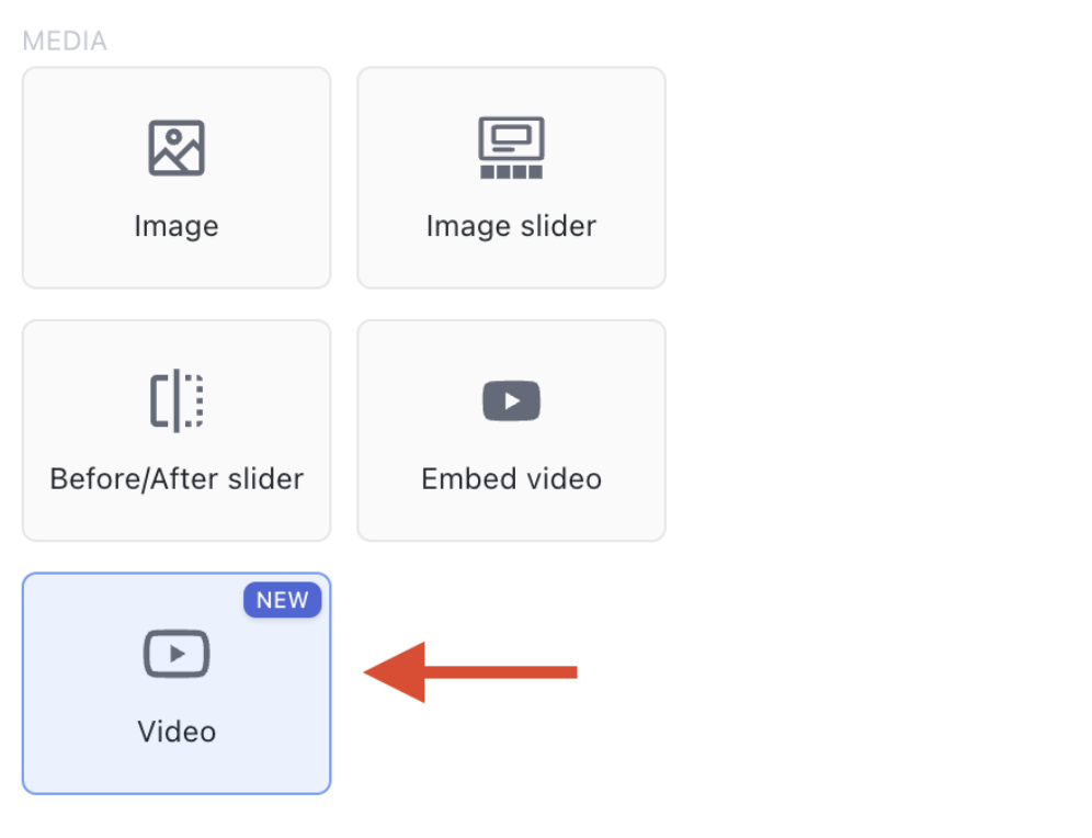
Click the element and upload your file, up to 200MB (larger files simply take longer to upload):
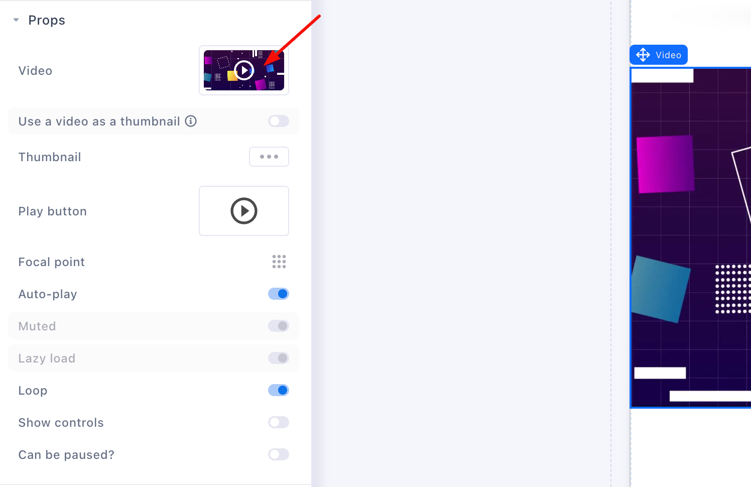
Its properties:
-
Thumbnail: upload a custom cover image, or use a short clip as an animated thumbnail.
-
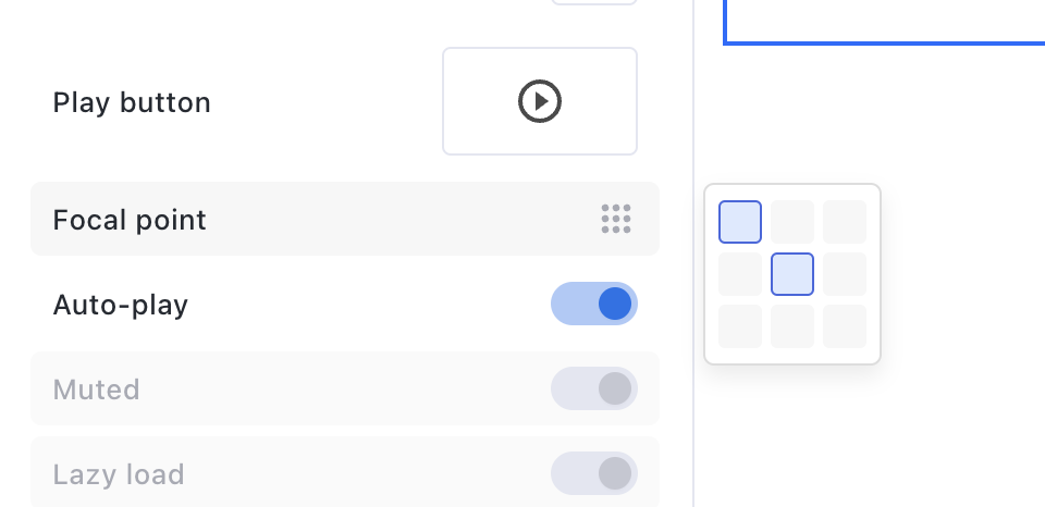
Play button: pick from several designs, set its color and behavior.
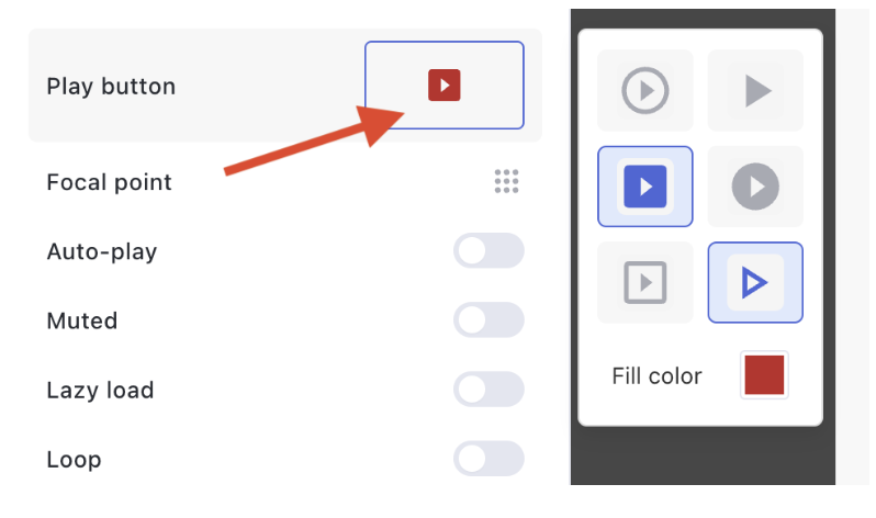
- Focal point: which part of the frame stays in view when the element’s width and height crop the video. It applies to the thumbnail as well. Set a height on the element to see it in action.
-
Autoplay: the video starts as soon as it loads. Autoplaying videos are muted by default, browsers require it.
-
Loop: plays again and again. Autoplay plus loop, with no controls, is the right setting for short silent demo clips, exactly where you’d have used a GIF.
-
Show controls and Can be paused: whether visitors get the play/stop bar, and whether they can pause at all. For a VSL, many advertisers disable both so the pitch plays through.
-
Lazyload: on by default, the video loads just before it scrolls into view.
-
Everything else works like any element: width and height, margins, borders, sticky positioning, per-device visibility, and click actions from the Interaction tab.
Embed Video element
The Embed Video element plays a video that already lives on YouTube or a similar platform. Paste the link into the Video URL field and the player loads automatically, thumbnail included.
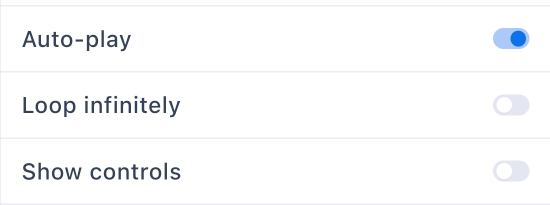
It has three toggles: Autoplay (muted by default), Loop infinitely and Show controls:
Use it when the video needs to stay on YouTube, for view counts or because it’s embedded in many places. Otherwise, upload to the Video element: cleaner player, faster page, no distractions.
Funnelish optimizes uploaded images and videos automatically, so a media-heavy page stays fast without you compressing anything by hand.