Every step of a funnel needs a clear next action: Buy Now, Complete My Order, Claim My Discount. The page builder has two CTA elements for that. Button is the shaped, styled call to action. Link is plain hyperlinked text for the quieter jobs, like “Trouble logging in?” or “No thanks, skip this offer”.
Buttons and links are the right choice for most pages: simple, clean, and they work. But they’re not the only way to capture a click:
Practically any element can be a CTA in Funnelish. Containers, rows and images all accept click actions from their Interaction tab, the same actions buttons use. A container styled as a “Yes, upgrade my order” card on a one-click upsell page, or a product image that submits the step, are CTAs too. Reach for those when the design calls for something bigger than a button; reach for Button and Link everywhere else.
Button element
Drag a Button onto the page and click it once to open its settings:

Click inside the button to edit the label directly. Button text is rich content: icons, emojis, bold, multiple sizes and lines can all live inside one button, so “Add To Cart” with a cart icon, or a big action line with a smaller reassurance line under it, is just typing:

The two settings that decide whether the button converts are the text and the click action.
Styling
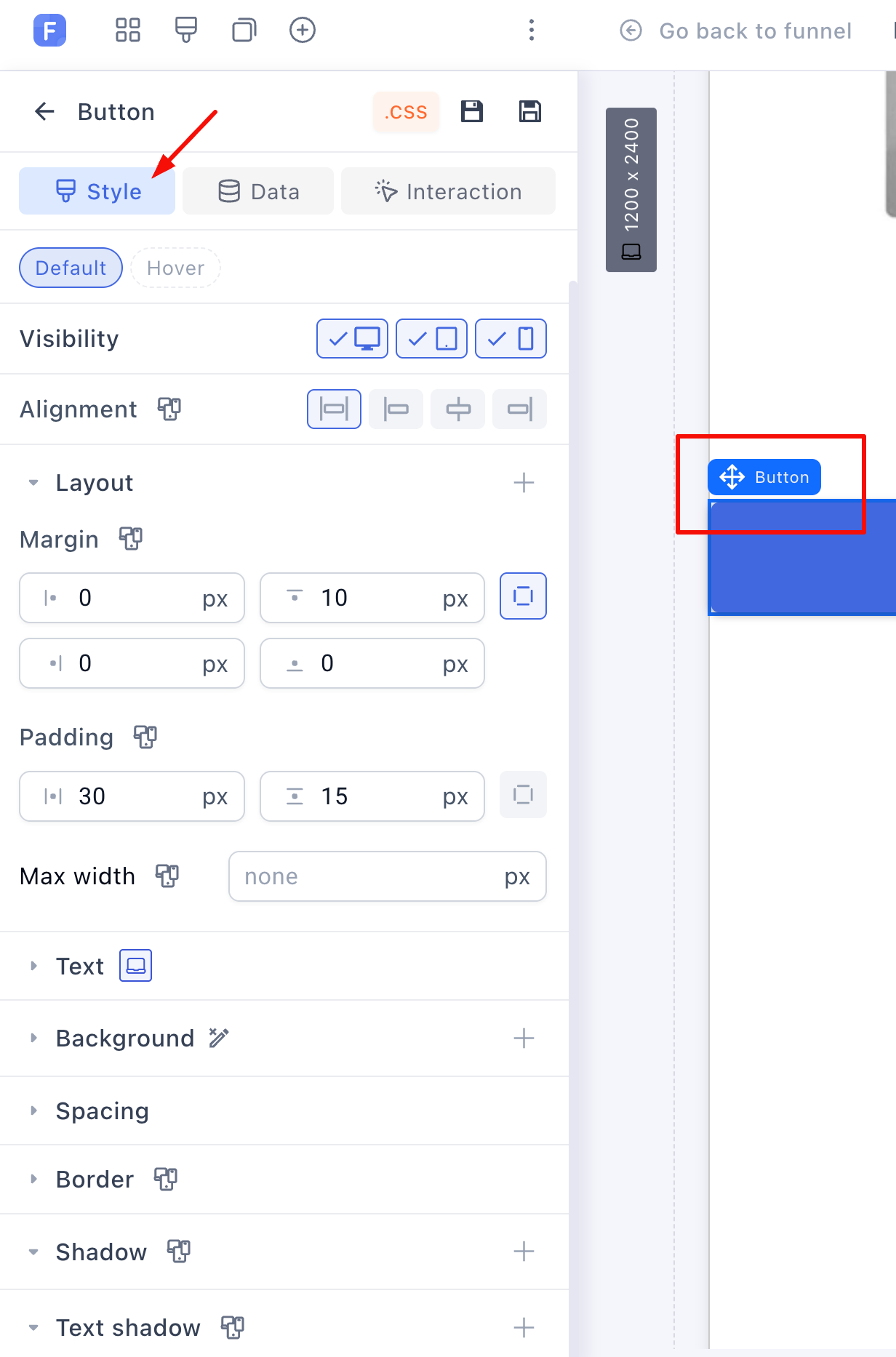
The Style tab holds the full toolkit: font, alignment, padding, max width, background color or a CSS gradient, borders, shadows and text shadows, line height and letter spacing:
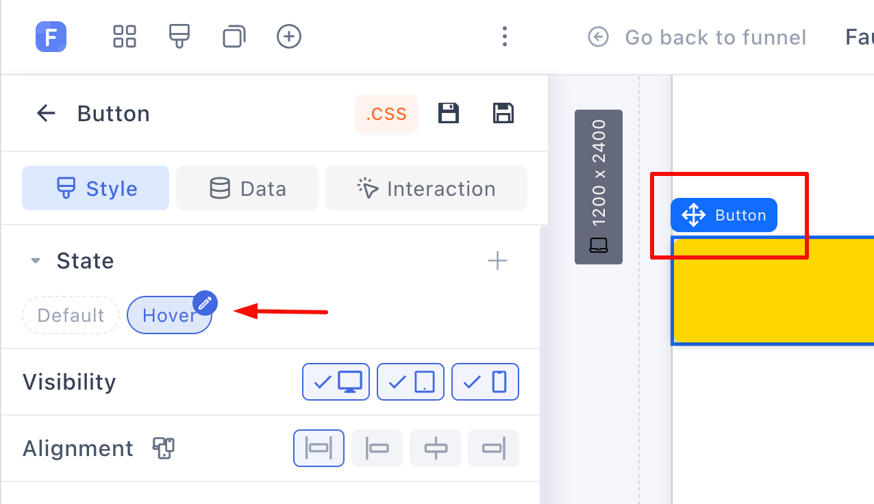
The button also has a separate Hover state, so it can change background, text or shadow the moment the cursor lands on it:
Buttons also support per-device visibility and sticky positioning, like any element.
The label can be bound to live data. Binding the button text to the selected product’s displayed price gives you buttons like “Buy now for $49” that stay correct when the price changes.
The click action
Assign what the button does under the Interaction tab, with On click:

-
Submit step: submit the customer’s details and payment, then move to the next step. This is the action for checkout and opt-in buttons.
-
Go to next step: move forward without submitting anything. Use it on landers and advertorials.
-
Go to URL: link to any external page.
-
Go to section/row: jump to another place on the same page. On a long-form page, a “See the offer” button that jumps straight to the checkout section keeps hesitant readers moving.
-
Show popup: open one of the page’s popups.
Buttons can also react to hover and mouse leave, not just clicks. And remember: this same Interaction tab exists on containers, rows and images, which is how any of them becomes a CTA.
Link element
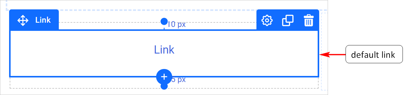
A Link is a standalone piece of hyperlinked text. Same jobs as a button, minus the shape, for actions that shouldn’t compete with your primary CTA:
Set the text in the Link text field:

Then set the destination under the Interaction tab:
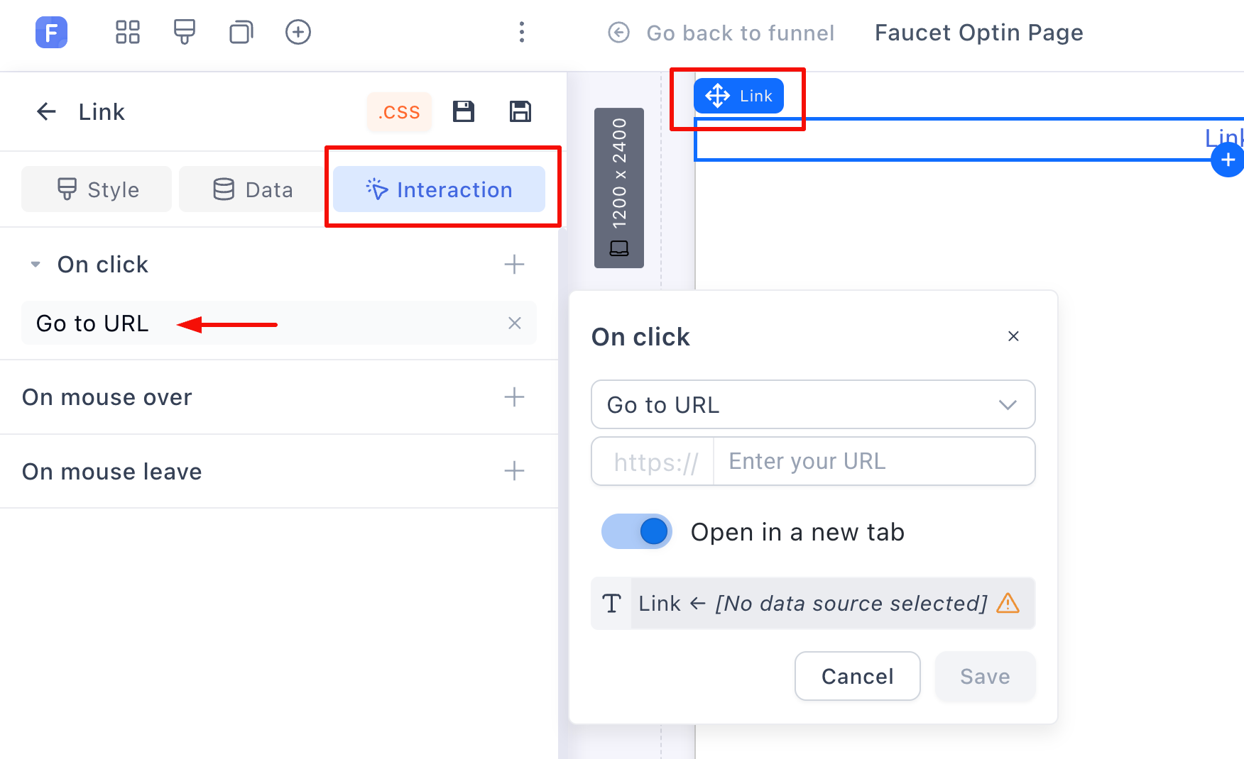
Links have three styleable states: default, hover and clicked. Style the text, change the hover color, add a text shadow:
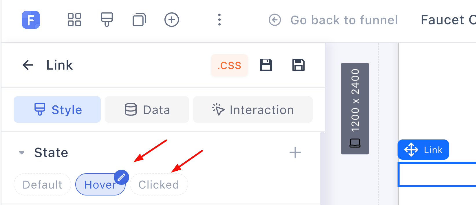
Both the link’s text and its URL support data binding, so a link can point somewhere dynamic, like the current blog post or a bound product page.
One primary CTA per step
A practical rule that pays for itself: each step gets one visually dominant button with one job, repeated down the page if the page is long. Secondary actions (“skip this offer”, “read the FAQ first”) belong in Link elements or muted buttons, so the eye always knows what the main move is.